
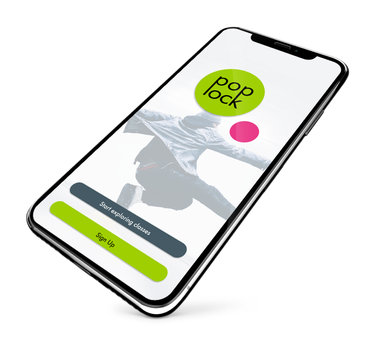
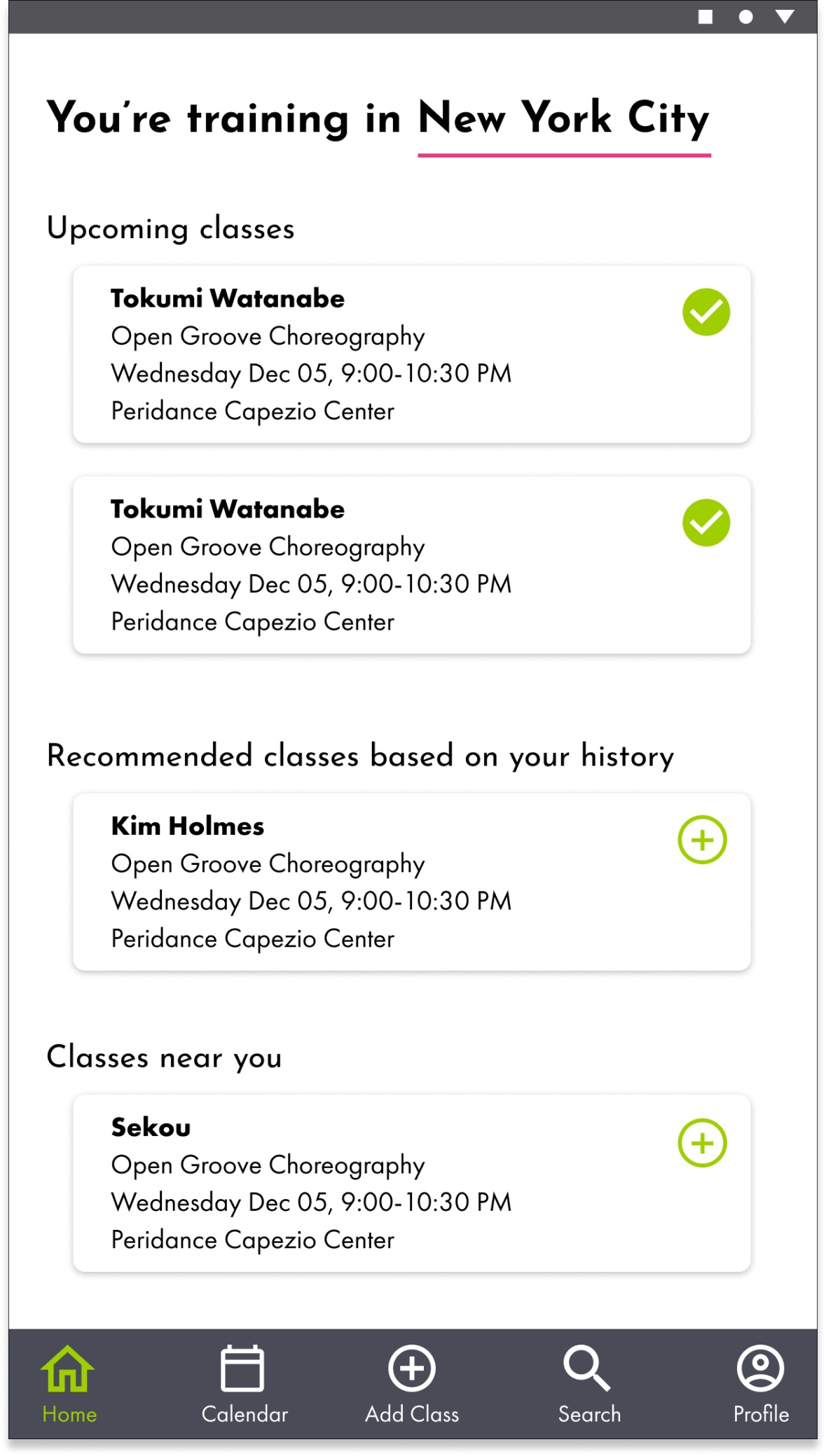
Poplock is a dance class aggregator and schedule manager for students and teachers/organizers alike.
Born out of my own frustrations as an urban dancer in NYC, Poplock is an app geared toward a strong and ever-growing community of dancers, aiming to provide the connections the community needs to keep thriving.
Design Roles
- UI Design
- UX Design
- Branding and Identity
Design Deliverables
- User Surveys
- Competitive Analysis
- User Stories
- User Flows
- Content Strategy
- User Personas
- Wireframes
- Prototypes
- Usability Testing
- High Fidelity Mock Ups
Specifications
Tools:
- Sketch
- Invision
- Figma
- Usability Hub
Timeline:
- Nov 2018 - Dec 2018
Collaborators:
- Team of mobile and backend developers
Overview
Problem
New York is home to a plethora of urban dance classes, workshops, and showcases happening on any given day. However, discovering these events can be difficult and requires searching through a variety of different platforms, including Instagram, Facebook, individual studio websites, etc.
Solution
Poplock seeks to simplify the process by providing a single platform by which dancers can discover local dance events in New York, and by providing a hosting platform for teachers/organizers to get the word out about their events.
User Research + Competitive Analysis
I must preface that I am creating a product that for a community that I am a big part of. I myself am an urban dancer in the NYC area, and this idea arose out of a personal frustration linked to the time spent searching for classes.
Before starting the project, I did a bit of informal “user surveying” to gauge if people had similar frustrations, and lo and behold, they did! As I already had this community of dancers, I deployed the survey to them and received some great feedback.
Key user survey results
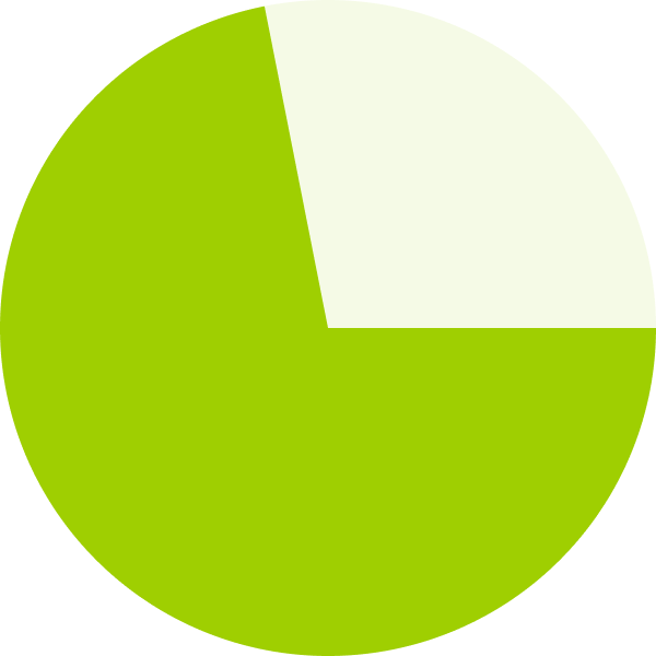
71.9% users do not find out about events in time
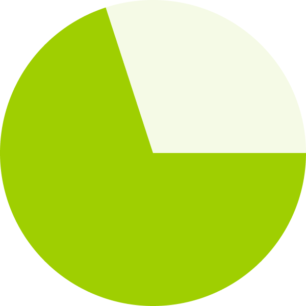
70% teachers/organizers use more than one platform to promote their events
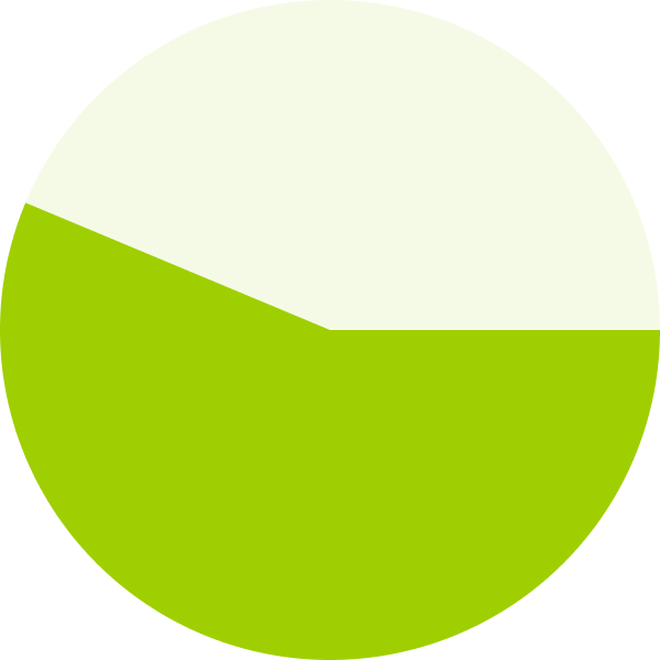
56.3% do not want to check all of their social media platforms to find a class
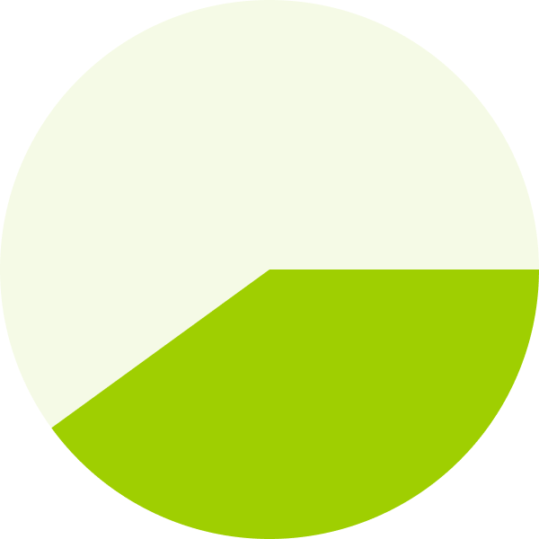
40% of teachers/organizers don't like having to post to multiple platforms
Competitive Analysis
Mindbody
Cloud based business management software and app for classes focused on physical wellbeing
- Provides a software for businesses to manage their classes and events
- Has two separate platforms: one for users and one for organizers
Eventbrite
Event management and ticketing website and app
- Accepts a wide range of events, catering to any and all interest groups
- Ability to sell tickets through the platform
- Has two separate apps: one for users and one for organizers
Meetup
Organizing platform for hosting events for people with similar interests
- Accepts a wide range of events, catering to any and all interest groups
Opportunity
After performing a SWOT analysis, I determined the following opportunities for my product:
- Create a service specific to the dance community, as it is big enough to warrant its own platform.
- Create a distinguishing brand , as the brands of all three current competitors are very similar to each other.
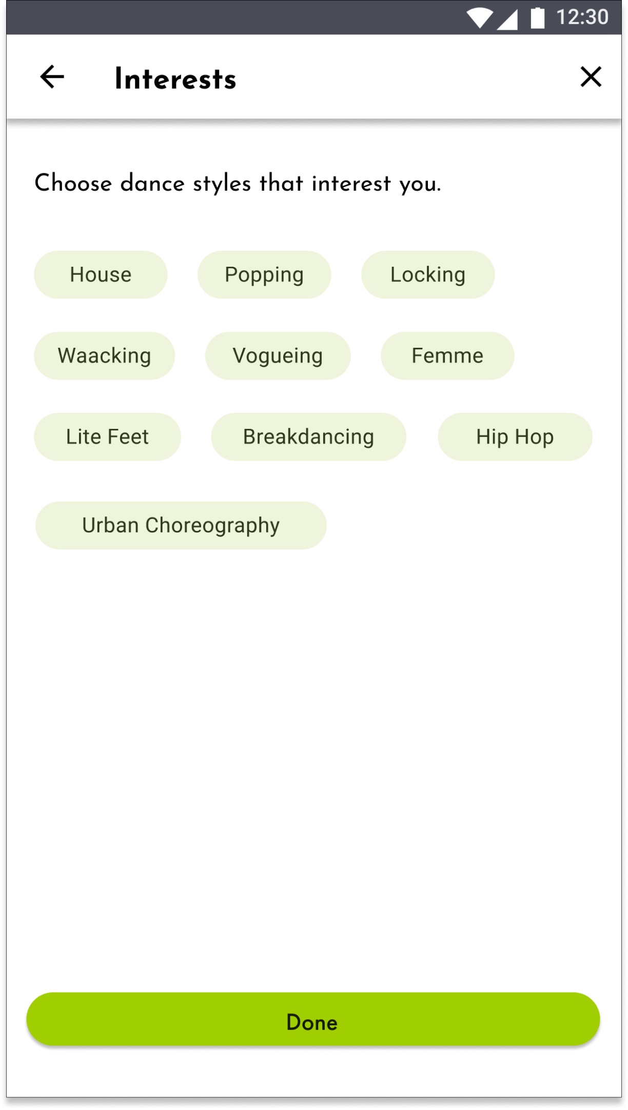
- Cater to the dance community by providing features specific to dance , such as noting styles and teachers of interest, and providing specialized event posting feature that is specific to dance events.
User Personas
I tried to find three people that represent three distinct user groups, someone that is just a student, someone who is a teacher and/or organizer, and someone who is both. This helped me start identifying the main features I wanted to focus on.

Charles Brandon
Videographer, dancer, director of a competitive dance team, dance teacher
Gender: Male
Location: Queens, NY
Age: 26
“This small but intense community can really use some organization.”
Frustrations
A big frustration for Charles is having to use apps like Instagram and Facebook, which he’d like to avoid, in order to find classes to take. He also gets frustrated when he misses a class as it was only posted on social media. Another frustration is having to look through studio websites to discover new classes, with little information about the classes on the websites. It ends up being hard for him to keep track of what’s going on, and to build some sort of training schedule.
Goals
- Avoid using any mainstream social media apps.
- Occasionally teaches classes and workshops, and would like to promote easily.
- Could use this app as a way to get the word out about classes within a studio he is building.
Key features determined from user surveys
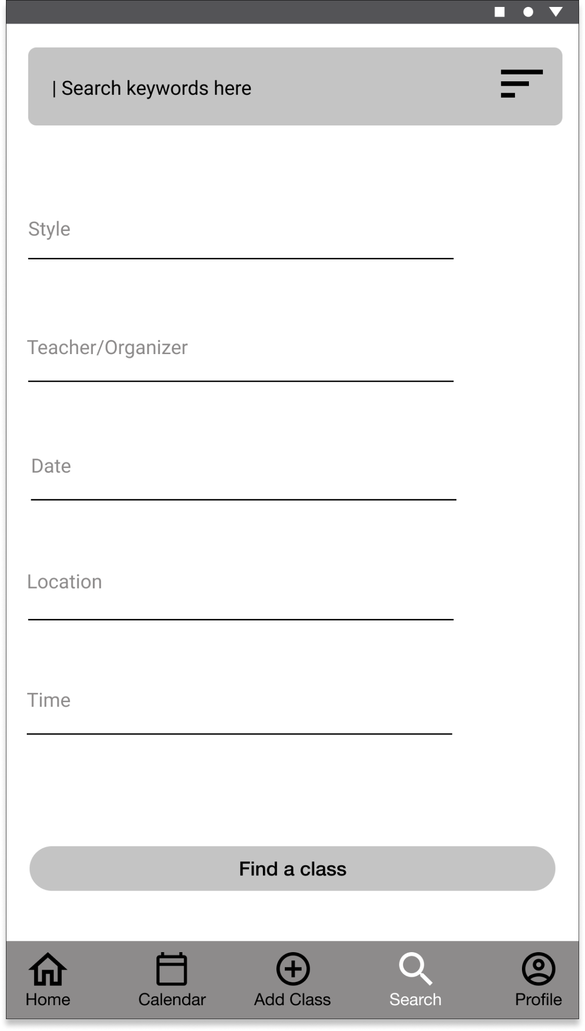
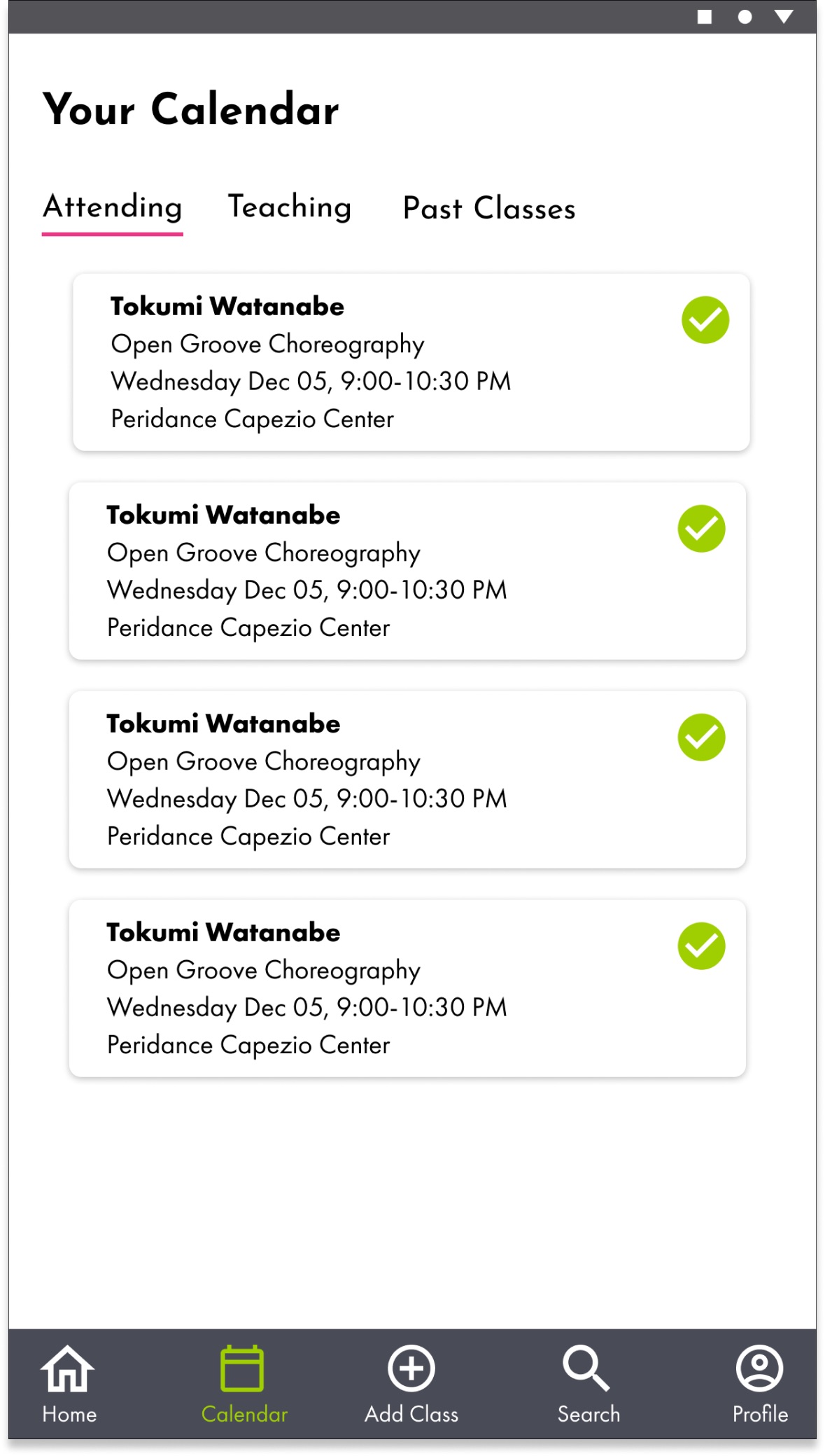
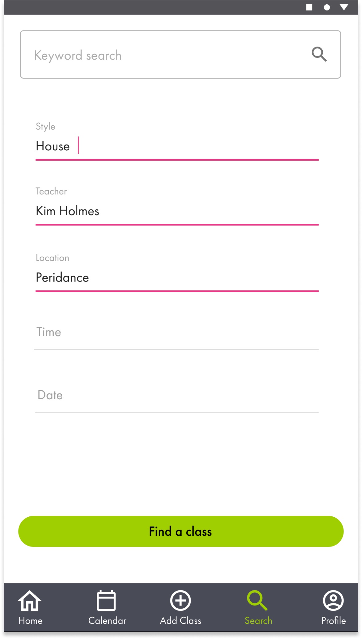
Searching for classes using criteria specific to dance
Saving classes to a calendar
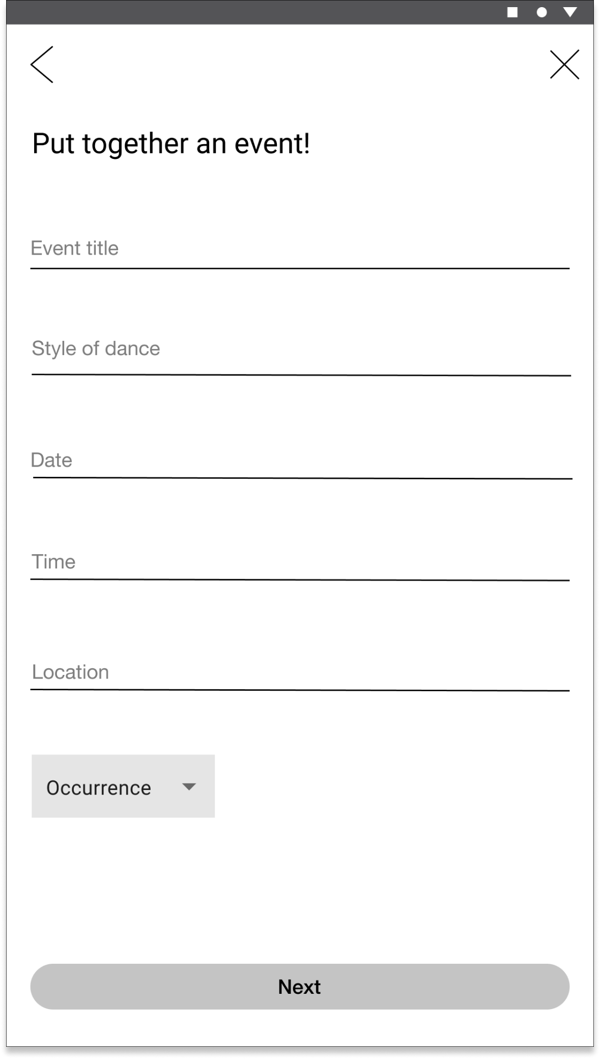
Ability for teachers and organizers to post their events
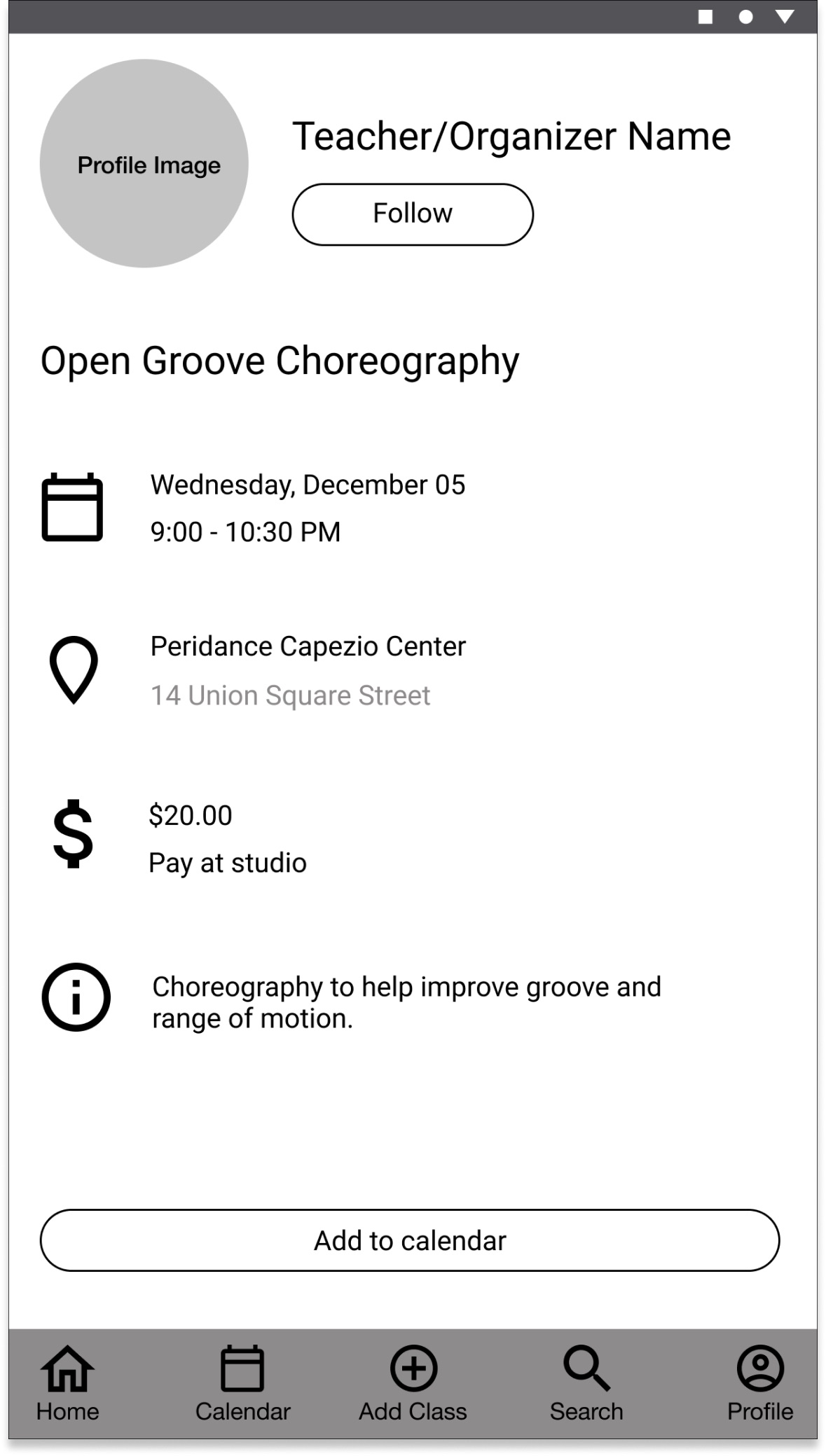
Ability to build a profile with a bio and preferences
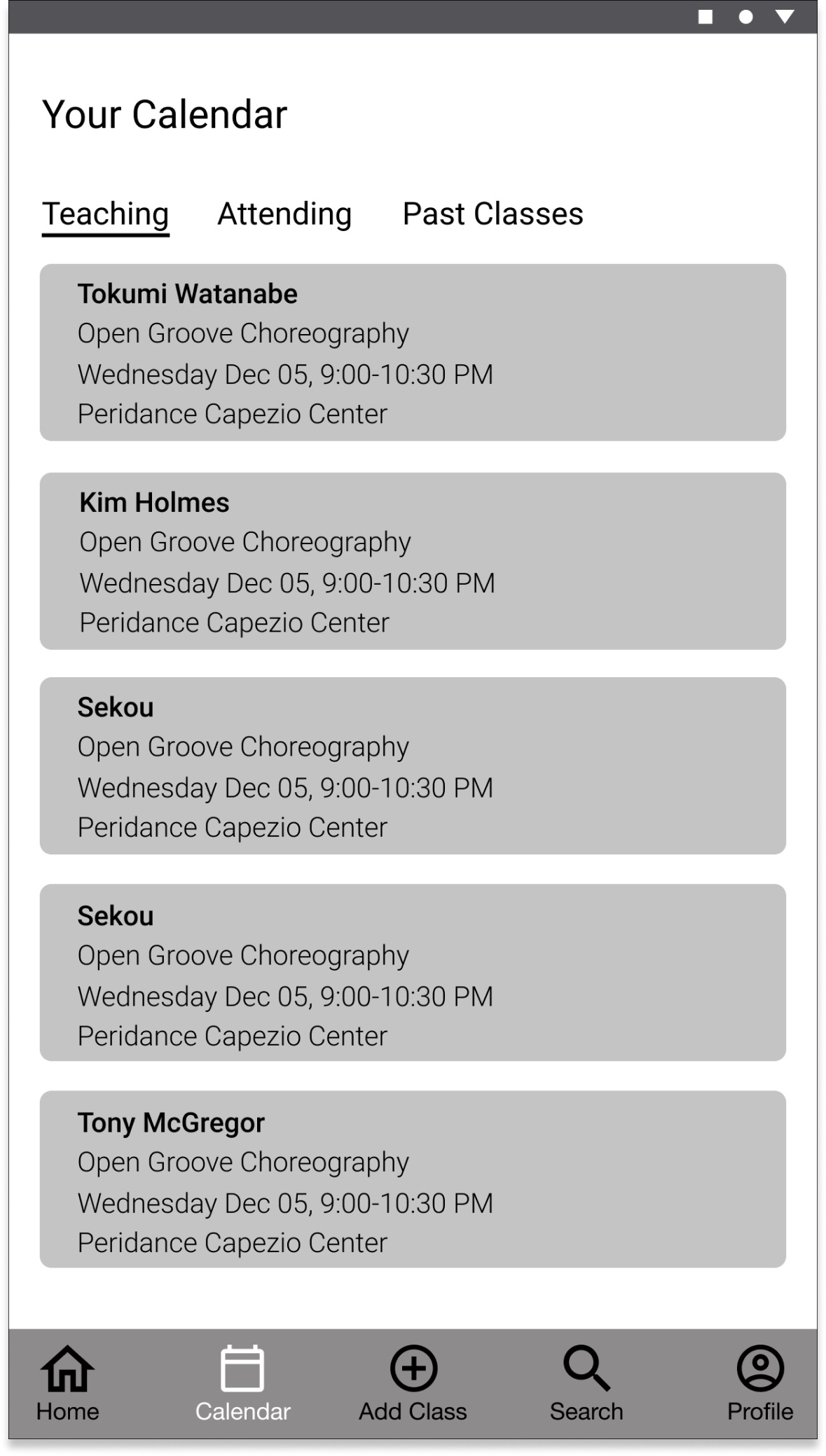
User Flows
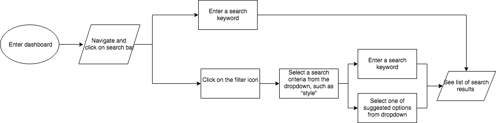
Wireframing
Sketching out these wireframes was different than how I’ve sketched before, as my plan for this product was to make a native app, which meant designing directly for the phone where I am used to designing more so for responsive websites. And so the learning commenced! I also had the added challenge of determining how to structure this app to be a product that looks very similar to both student and teacher users, with only slight variations in experience for the teachers, having the ablity to post an event. This decision came out of discussion with dancers as well as developers, and deciding that we don't want to make the experiences for the two user sets different, as we want to emphasize the idea of one community and level the playing field.
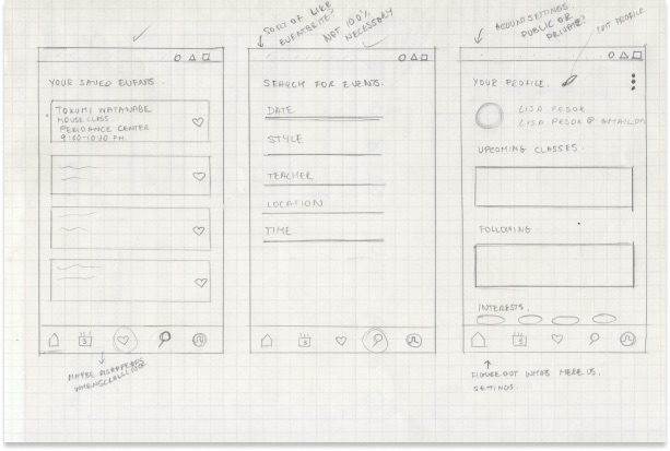
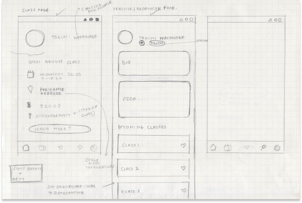
Wireframe Sketches
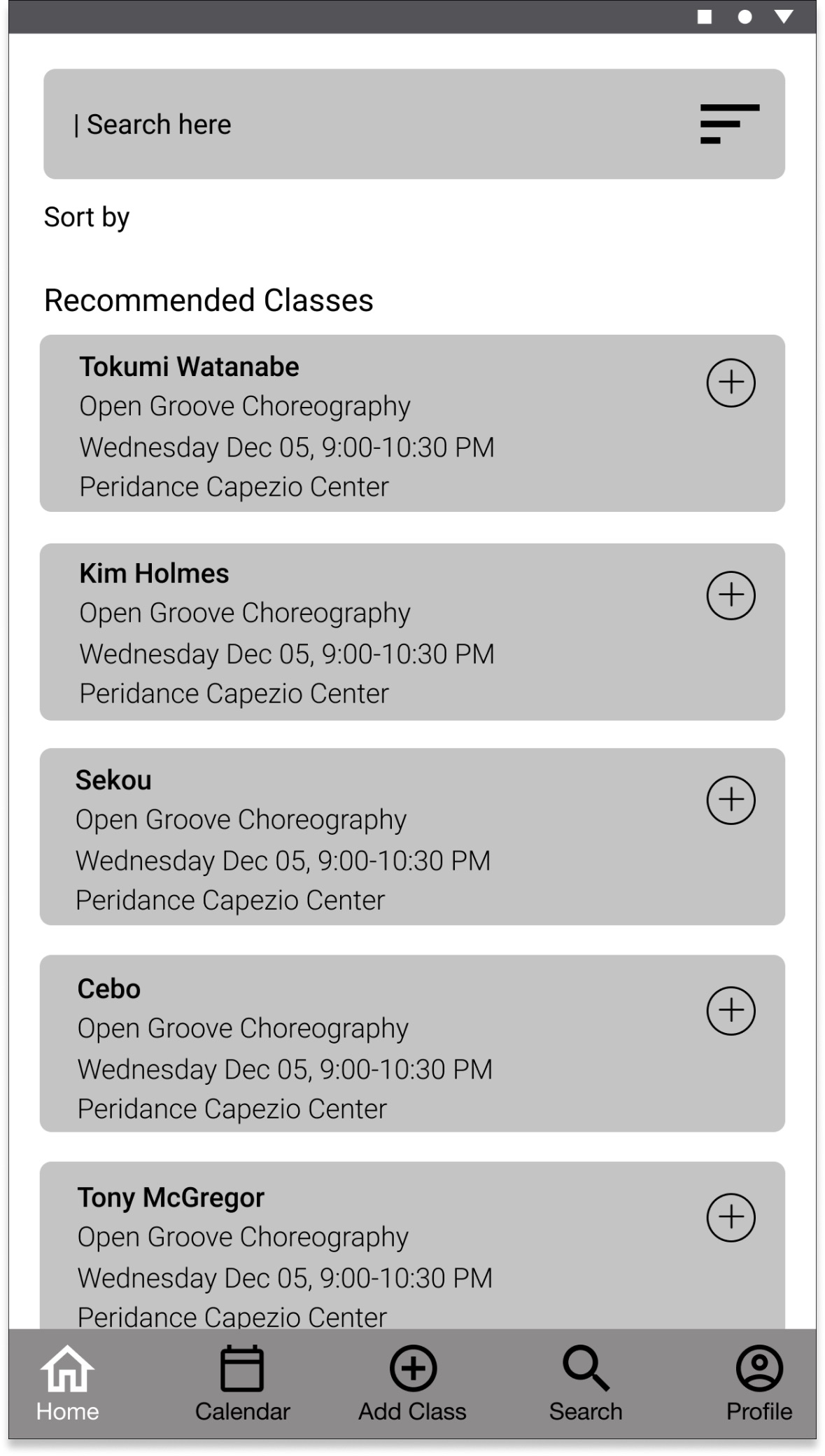
Wireframes in Figma
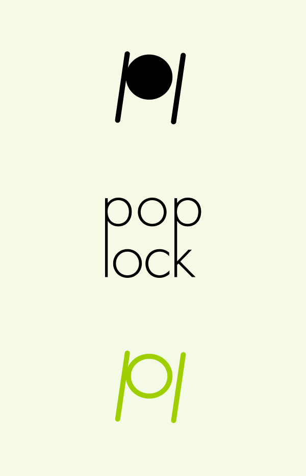
Branding
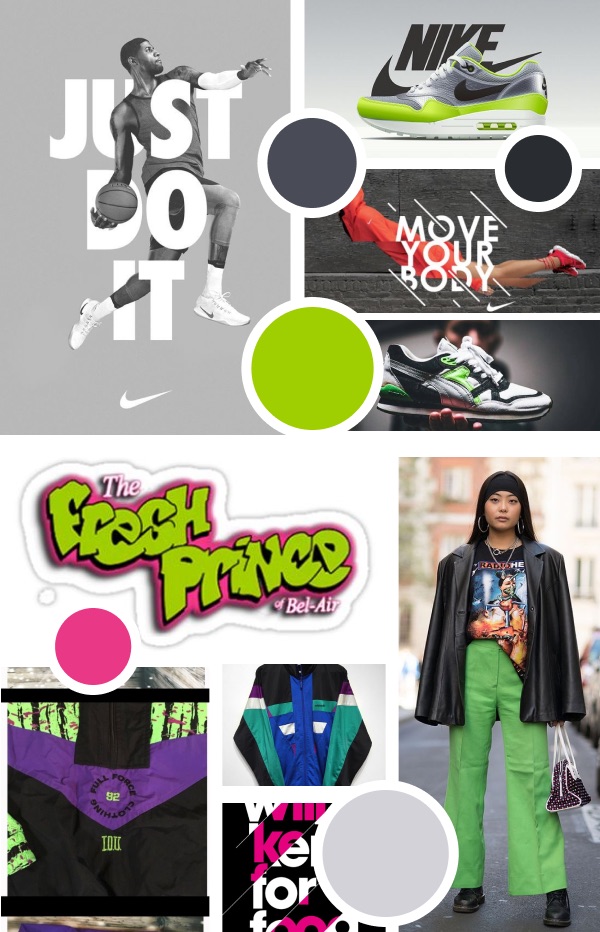
Stongly considering the demographics of my users, I pulled visual inspirationg from the younger urban streetwear style. With this in mind, I structured a mood board consisting of streetwear, streetwear brands and clothing styles typically associated with urban youth, as well as the street dance culture. Brands like Adidas and Nike were at the forefront, providing a basis for branding competition. Pulling from the clean aesthetic that these brands provide, mixed with the bright colors of the street wear styles, the resulting brand colors, logo, and typography are clean yet fun and inviting.
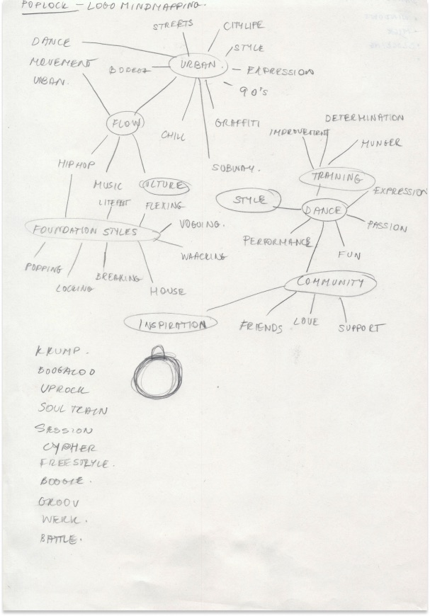
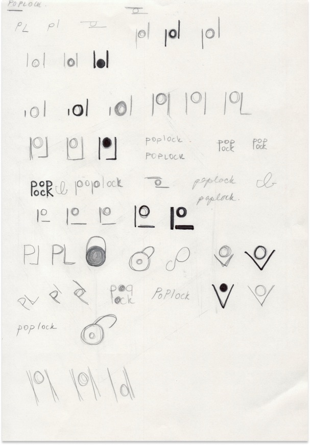
Mind Map and Logo Sketches
Moodboard and Logo Refinement
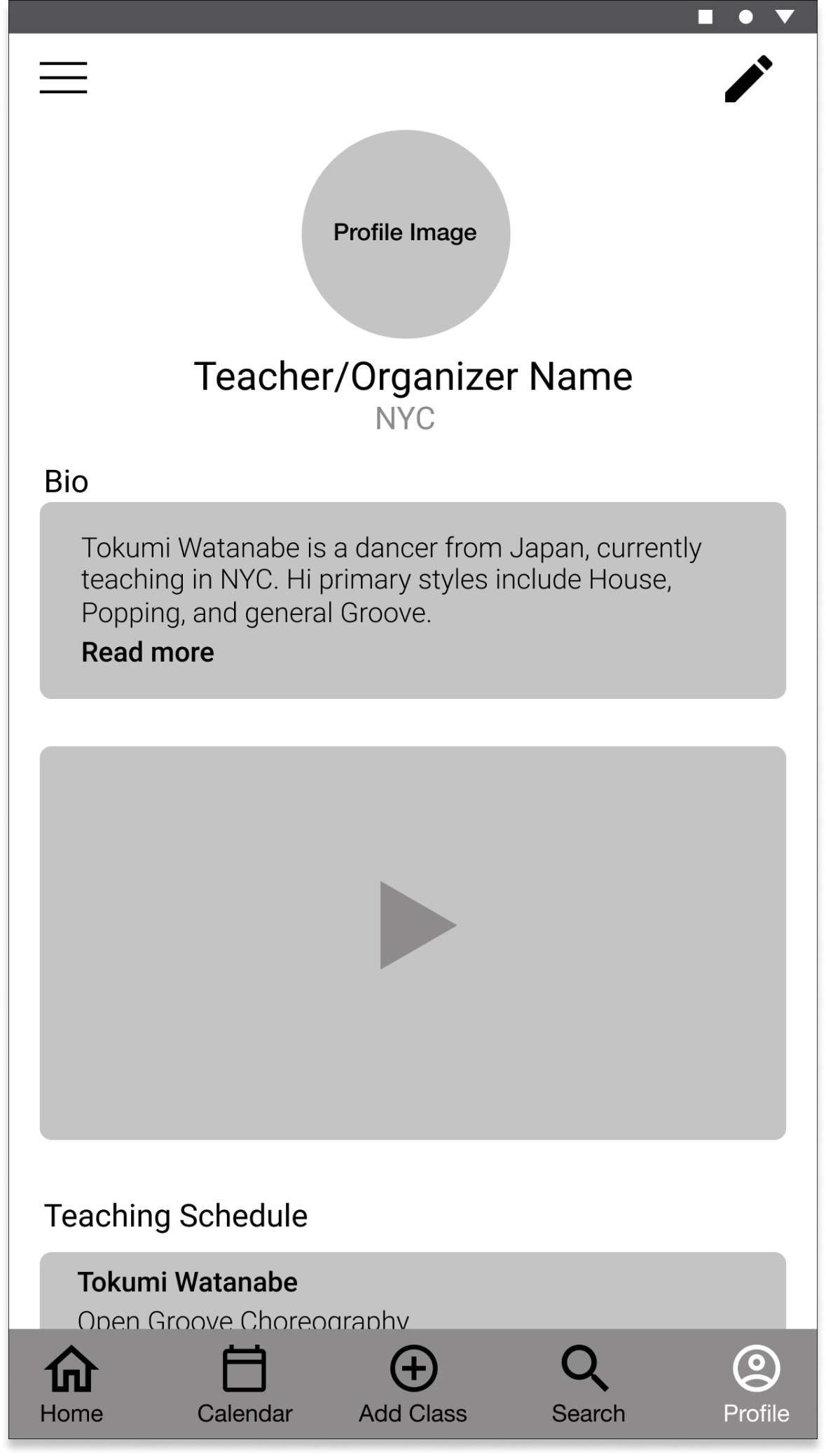
High Fidelity Mockups
Exploration
As I moved into high fidelity, I wanted to keep this fun yet clean. Urban dancing is born in the streets, many of the styles right here in New York. I really wanted the pops of color to be energetic and stand out, while also providing a clean and easy to read layout, as there would be a solid amount of text and information we're dealing with.
This dictated my decision to keep the background a clean white, with the main pops of color coming from the primary green I've chosen, with smaller details in the bright pink.
Revisions
I went through several revisions to get to the final point. All revisions were informed from user feedback. I would see that users were stumbling in certain flows more than others, and that helped to quickly pinpoint what exactly could be done better.
For some instances, I wasn’t sure what could have been done better straight away, so I made changes that I thought might work and tested those too. Below I will detail some of those changes.
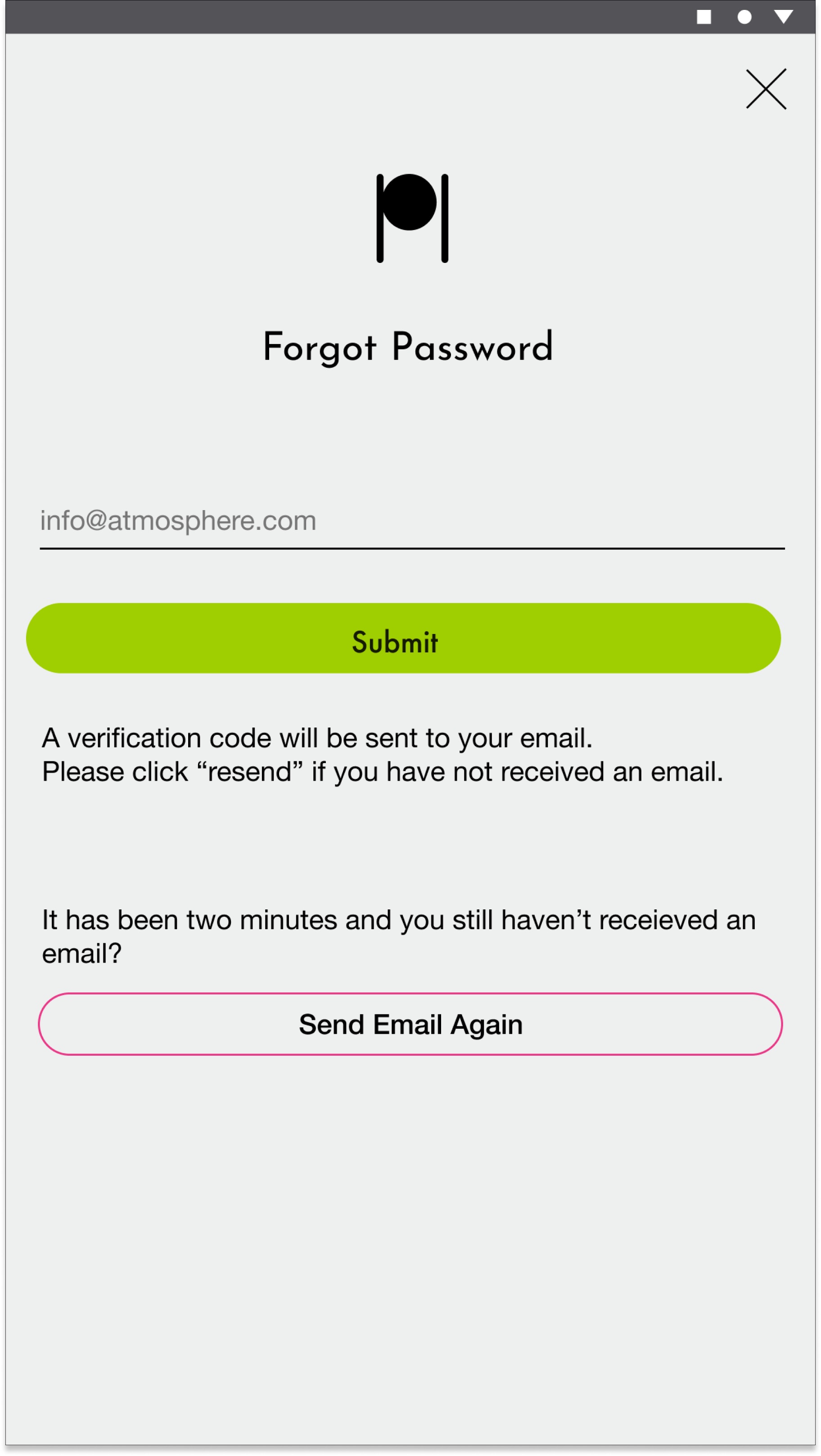
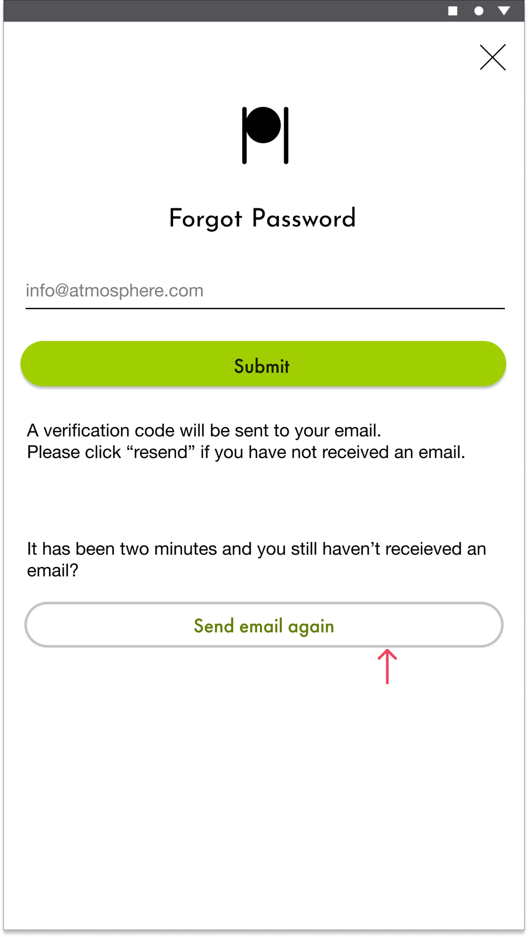
Version 1 "Forgot Password" page versus Verion 2
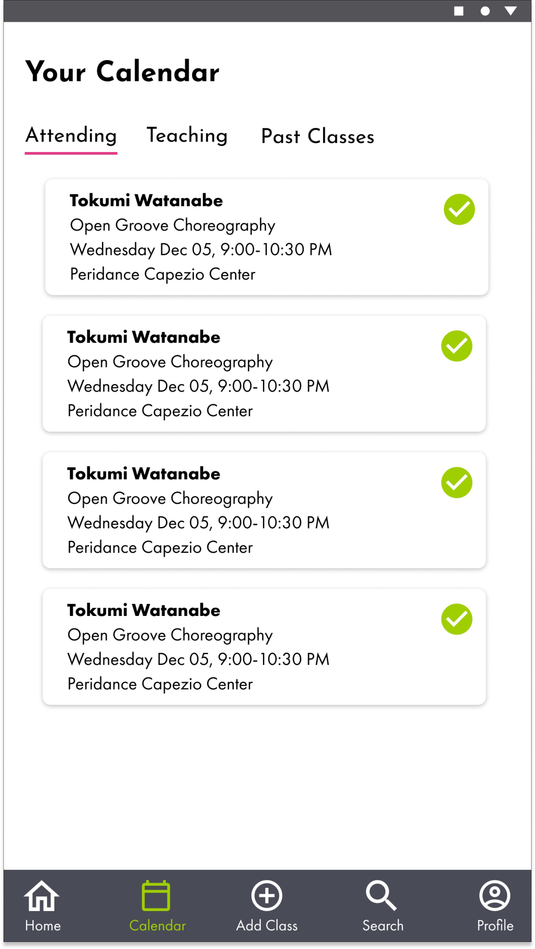
Version 1 "Calendar" page versus Verion 2
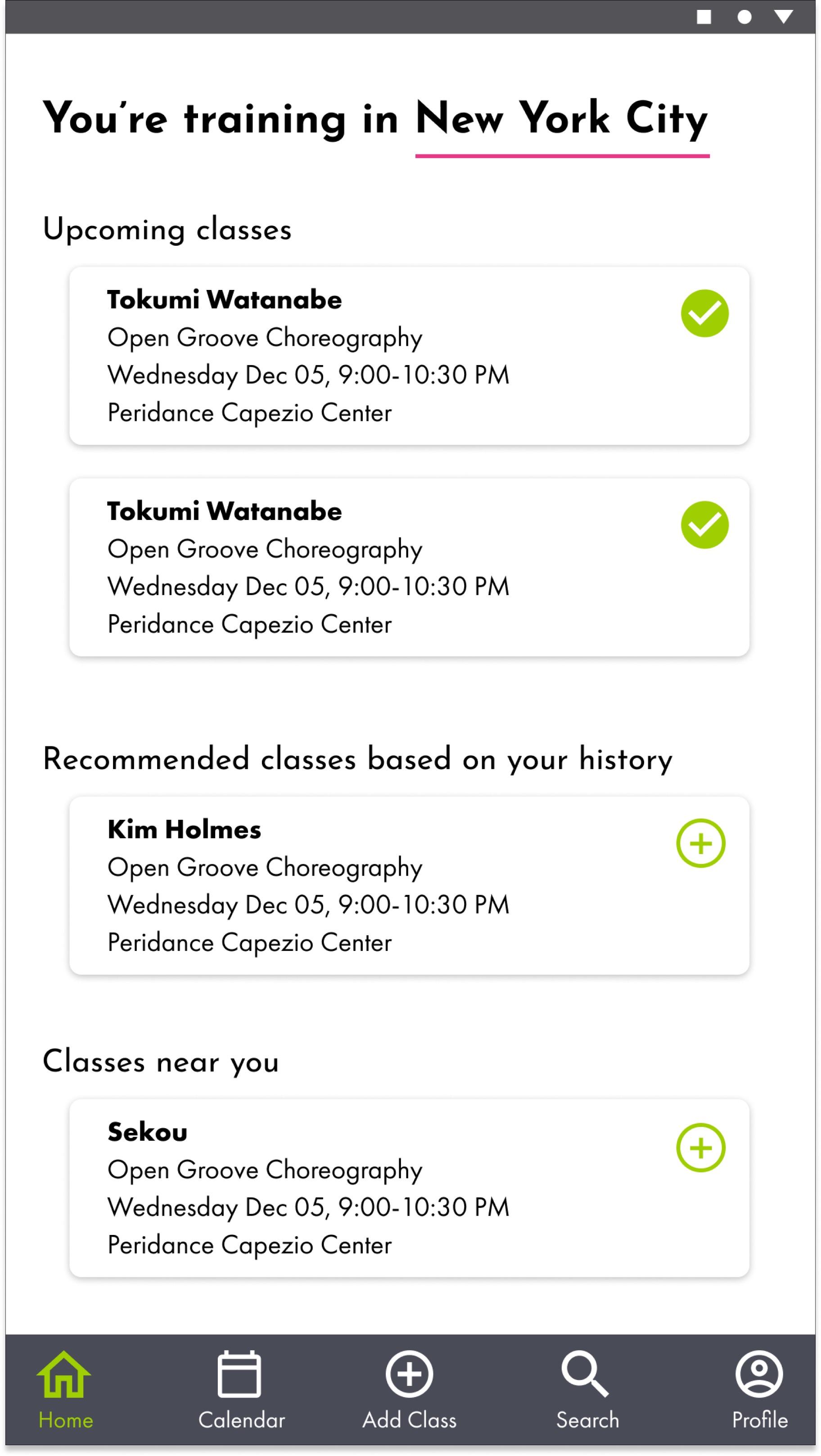
Version 1 "Dashboard" page versus Verion 2
Usability Testing and Discoveries
The main tasks that I tested were those that we determined would be necessary for an MVP. These included:
1. Signing up as a teacher
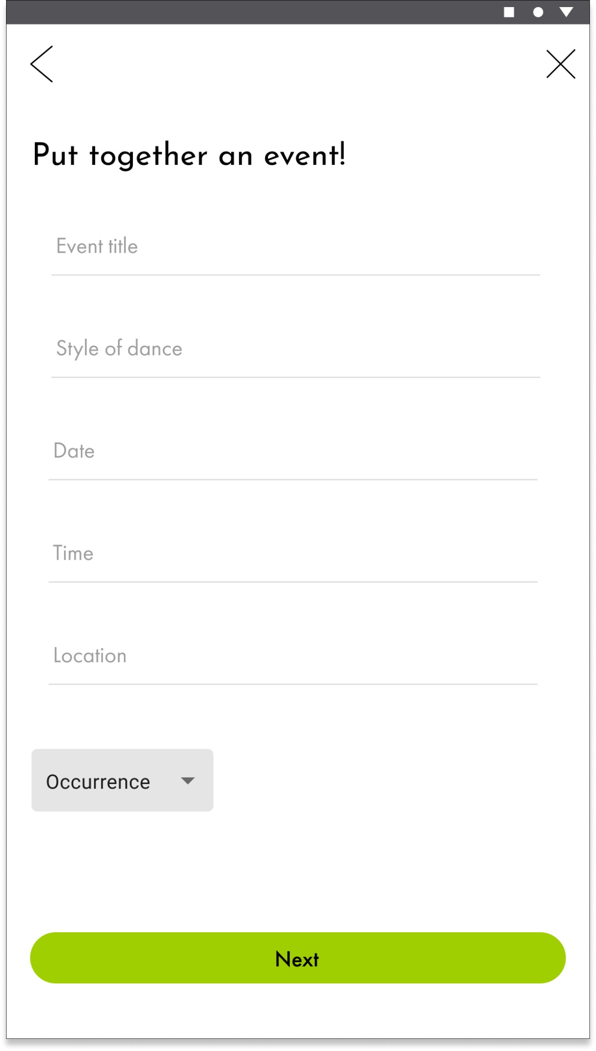
2. Searching for a class, and adding the class to a calendar
3. Adding an event posting, and editing that event posting
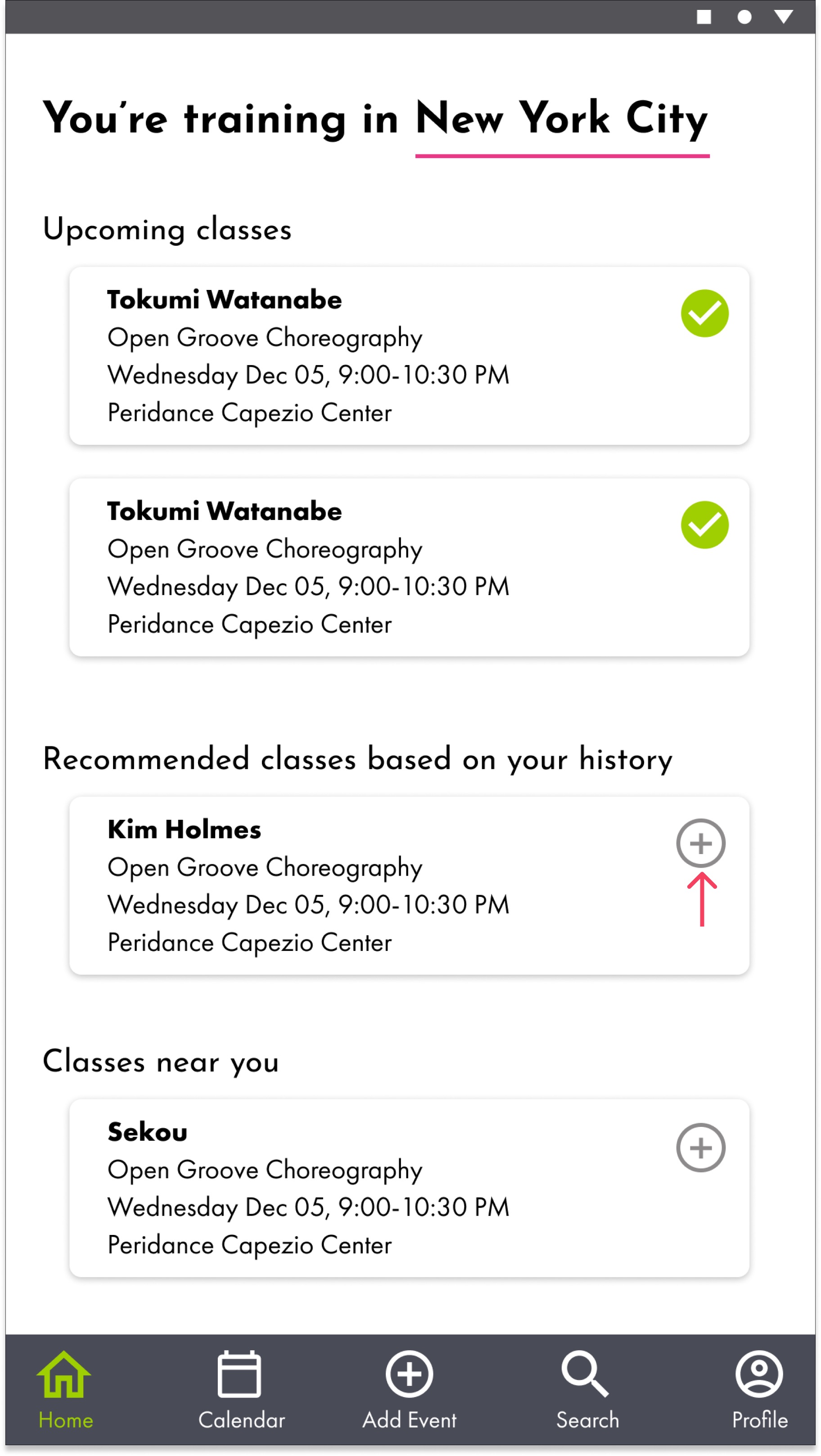
One of the bigger challenges was figuring out the best dashboard experience, as well as the class posting and editing experience. Something that I tested early on was the decision to make both student and teacher flows through the app very similar, with the intention of making the development process smoother, as well as with the intention to maintain a sense of unity between both students and teachers, as often dancers end up being both.
That said, the challenges in structuring that UI showed themselves. It became essential to make these flows as similar as possible, while making the teacher flows clear when needed. I made changes like adding destinations to the bottom navigation, changing around the user profile experience, and adjusting the class posting experience to fulfill the needs of the teachers.
Below I am showcasing some specific changes made based on the user testing.
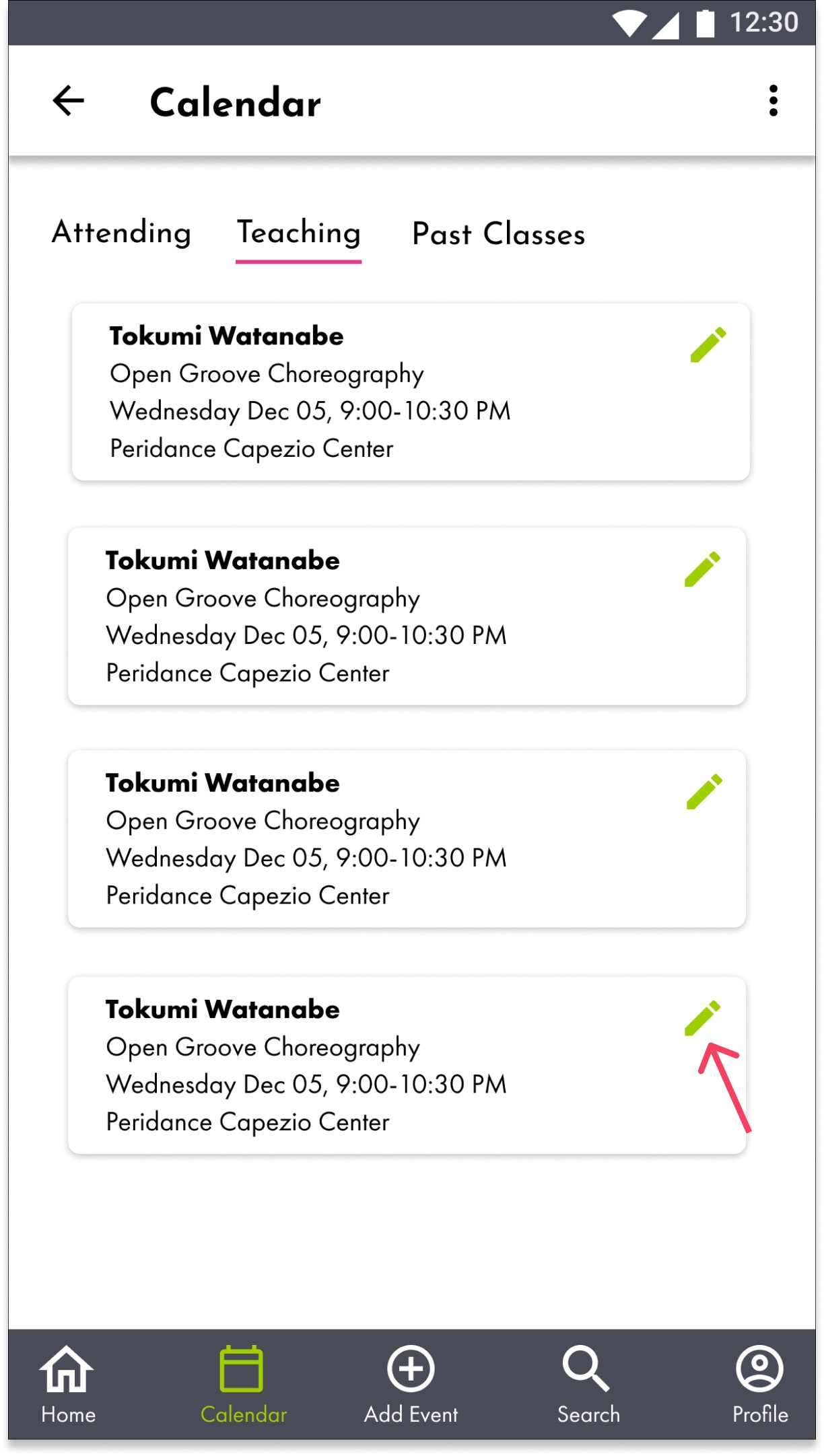
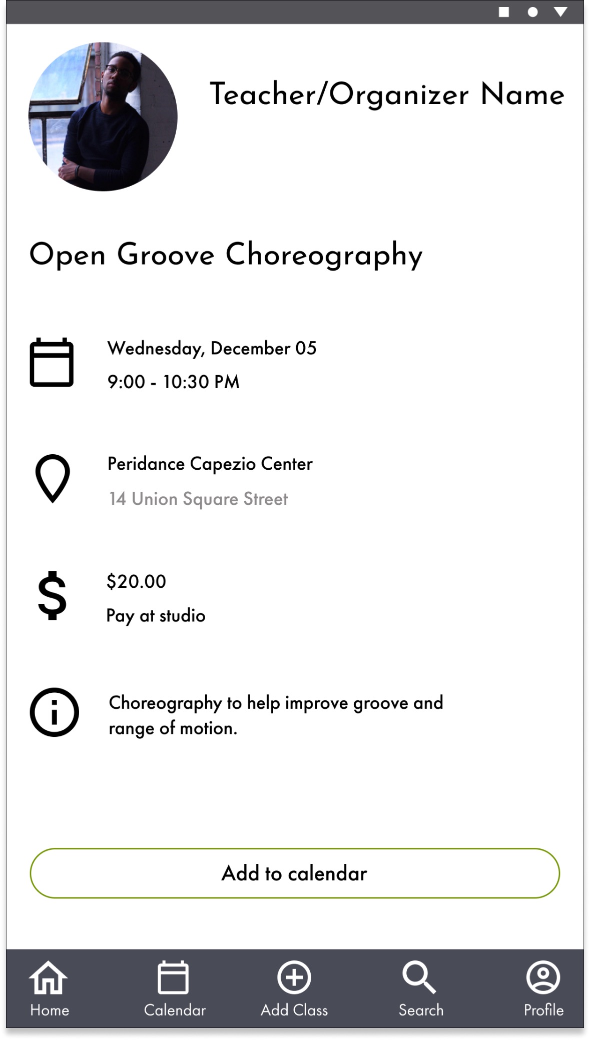
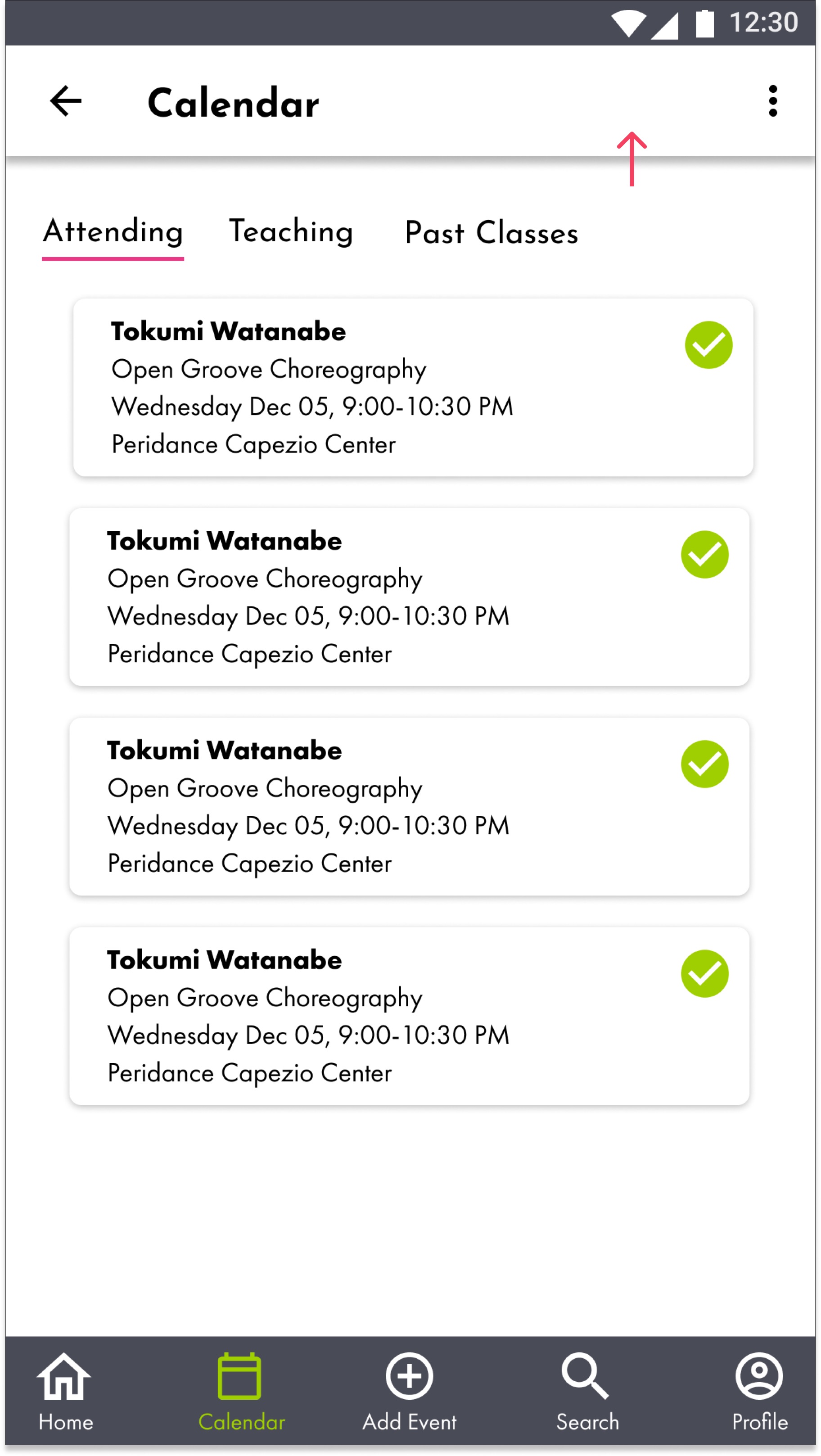
On easier accesss
When interviewing both students and teachers alike, I was getting similar feedback on easier access to function.
Here I've integrated the ability for a teacher edit their classes directly from their calendar, avoiding an extra step.
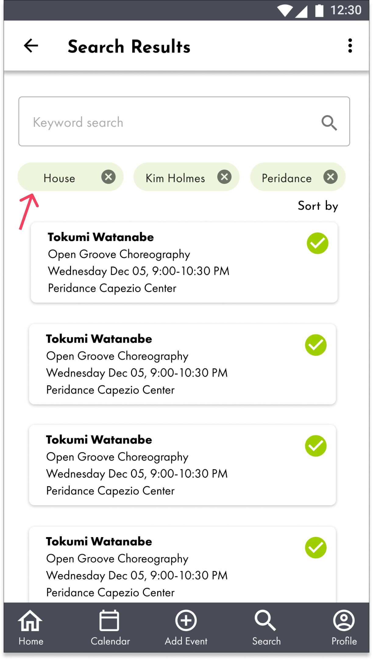
On better feeback
Something people mentioned was seeing what criteria they had used to search, and having the option to easily edit that criteria.
Referencing back to Material Design Guidelines, one way to show search criteria is to use the chip labels which have the "x" option to easily broaden search.
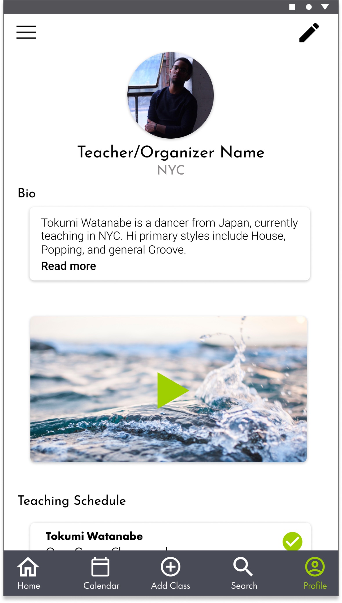
On reinforcing information
A few users mentioned that they wanted to see feedback about their work being saved. I initially did not have anything to show or tell the user that their work is safe.
I therefore added copy in a highlighted color that says “all changes have been saved” to assure the user all is safe.
Reflections
Below are some thoughts as I look back on the project. I wanted to make sure to I could quantify the exact takeaways, so I can have them readily available for future projects.
What Worked
Usability testing worked all the way.
Any time I wasn’t sure about an aspect of the UX or the design, a round of testing cleared up those questions.
What Didn't Work
Not following Material Design Guidelines right away.
I was floating somewhere in between, and only later in the mock ups phase realized that I was using material components, but not always properly. If using the components, I figured I should commit to the guidelines and really read the literature. Needless to say I learned quite a bit about bottom navigations and buttons.
If Given More Time
I’ve given this answer for other projects, but I would test more users. There’s SO much insight to gain from the people that would eventually be using the product, and it helps to get out of my own design bubble as much as possible.


