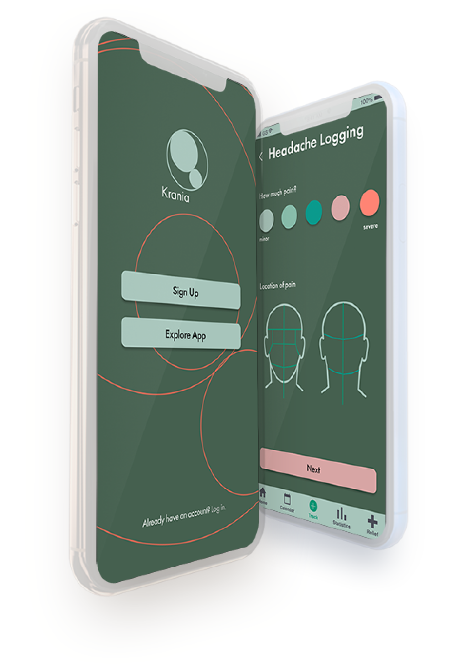
Krania is a headache and migraine pain tracking assistant.
I struggle with chronic headaches, which occasionally turn into migraines. At a certain point, I was starting to feel hopeless, that this is just my life and there’s no way out of it, but found that there was at least something about this problem that I could control — my environment. I started by tracking li festyle activities daily in a Google Sheet. I later realized that there were apps created for this purpose, but found that they didn’t provide the features I wanted, and didn’t have a very pleasing interface or experience. This is the root of my desire to build Krania.
Design Roles
- UI Design
- UX Design
- Branding and Identity
Design Deliverables
- User Surveys
- Competitive Analysis
- User Stories
- User Flows
- Content Strategy
- User Personas
- Wireframes
- Prototypes
- Usability Testing
- High Fidelity Mock Ups
Specifications
Tools:
- Sketch
- Invision
- Figma
- Usability Hub
Timeline:
- April 2019 - May 2019
Collaborators:
- Solo project
Overview
Problem
Existing apps that help people track their pain and triggers are clunky in design, literally painful to look at, confusing to use, and do not provide simple to use features for tracking what might be causing users’ pain.
Solution
Krania aims to provide an interface that is easy to look at, navigate, and incorporate into a daily life with pain. With darker shades of color, green color tones, and the prevalence of shapes and imagery over text, I hope that using this app will become a tool for crafting a life with less headache and migraine pain.
User Research + Competitive Analysis
Firstly, I was overjoyed to have a great response for this survey. Where on average I would get about 30 responses for my surveys, this time around I had 140 people respond to the survey, which provided me with invaluable information. It was also eye-opening in certain ways.
For one, I hadn’t realized just how much medication was out there to treat headaches and migraines, and how much of it people were consuming.
I also had a feeling that were a lot of people out there feeling hopeless, but to get it in writing like this, in direct response to my questions, was certainly heartbreaking.
Not only did this confirm that I was on the right track from a product perspective, but also from an empathetic solution perspective.
Key user survey results
Some quotes from responses to this question: What makes you interested in tracking your triggers?
“I'm desperate to learn how to avoid my headaches.”
“I hate how debilitating my migraines can be.”
“Trying to figure out these (bleep-ing) migraines”
“So I can find out what keeps me from living my life.”
Competitive Analysis
Migraine Buddy
Migraine tracking app
- Automatic sleep and air pressure tracking integrations
- Strong community of users that support each other
Ouchie
Chronic pain management app
- Allows for tracking a variety of chronic pain, not just headache pain
- App partners with pain management organizations to provide improved patient experience, as well as medical advisors
- Platform allows connection with doctors and other patients that are working through chronic pain
MyFitnessPal
Fitness and nutrition tracking
- Users can scan barcodes, save meals and use tools for fast tracking
- App provides resources such as informational videos, tutorials, and recipes to provide a well rounded fitness experience
Opportunity
After performing a SWOT analysis, I determined the following opportunities for my product:
- Create less cluttered, and easier to use data input system.
- Considering someone is in headache or migraine pain when they are engaging with app, ensure that the design provides no further irritation to the user.
- Provide an easier to read and understand set of data on the correlation between environment/well-being and chronic pain.
- Make connections between pain and environment/personal factors that the user might not have thought of, and therefore assist in decreasing instances of pain.
User Personas
I developed personas for three different types of users I might get for this app. These personas are:
- People struggling with chronic headaches
- People struggling with chronic migraines
- People struggling with both chronic headaches and migraines

Anna Beets
Ceramicist, Business Owner
Gender: Female
Location: Queens, NY
Age: 32
“I want to be successful and happy, and these migraines are holding me back.”
Frustrations
Anna is bogged down by the pain and she feels hopeless. She wants an action plan to get her out of this migraine hole. She badly would like to understand how to prevent her migraines so she can reach her full potential professionally, creatively, and even just find that peace emotionally.
Goals
- Anna wants an easy tool to track everything to do with her migraines, in order to figure out how to at least prevent them some of the time.
- An app would allow her to track easily on the go, and have a record of everything that she’s avoiding or trying.
Key features determined from user surveys
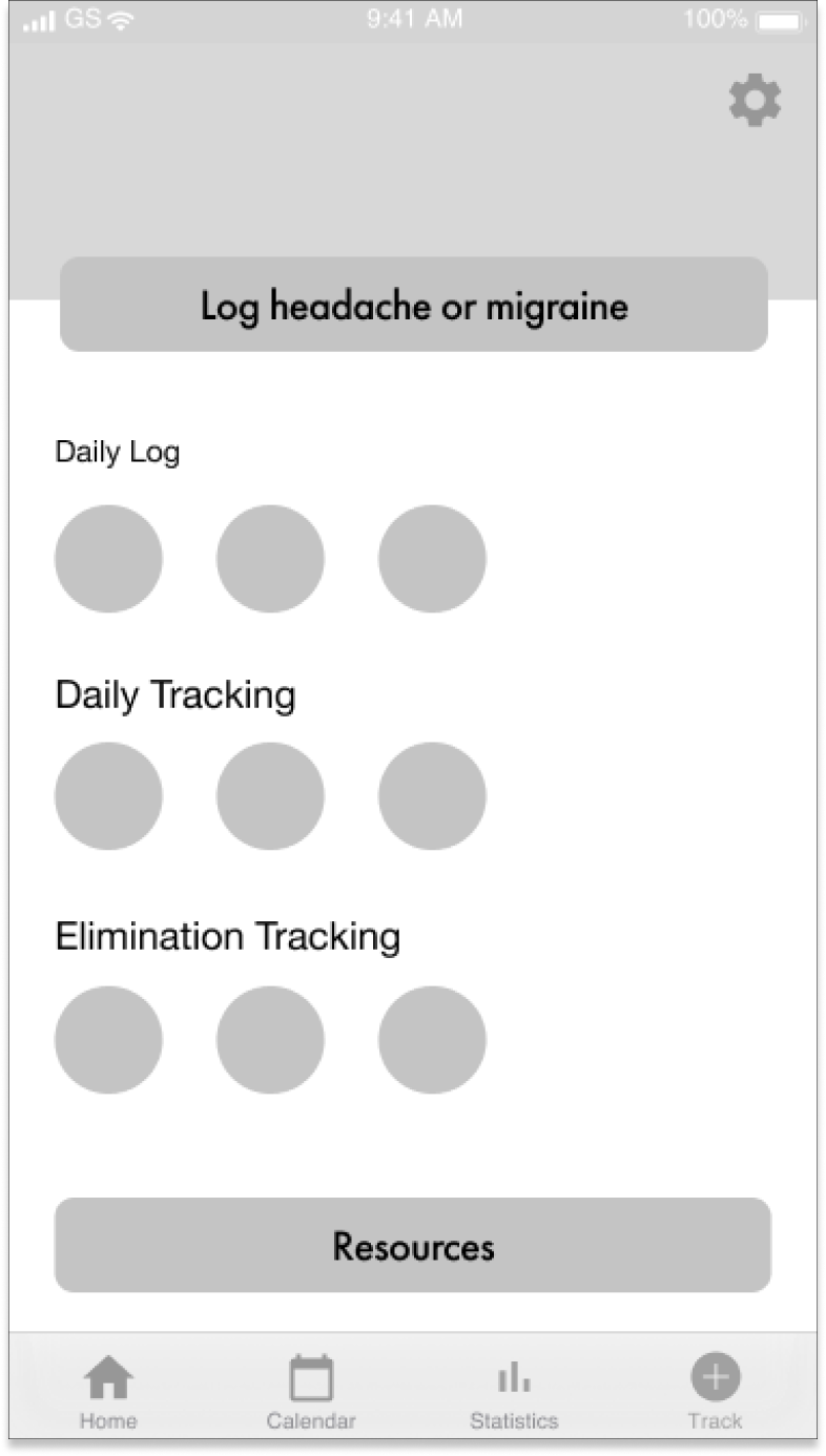
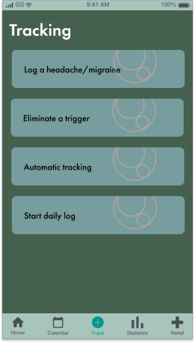
Log just headache or migraine pain
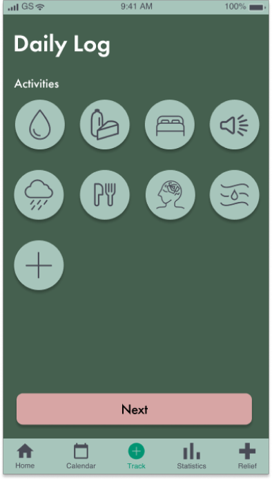
Ability to have a daily log of activities
Turn on automatic tracking for activities like sleep
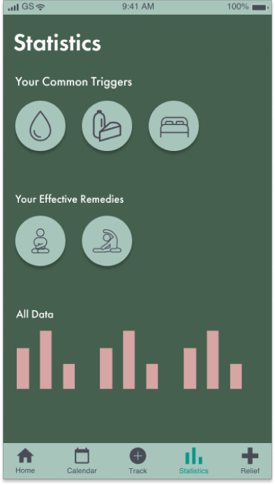
See a list of trends base on data being input
Track remedies and their effectiveness
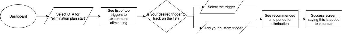
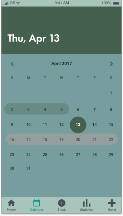
User Flows
Wireframing
In my first attempt to build this project out visually, I tried to keep in mind the mantras that I felt should be guiding this design. Simplicity and clarity. Little to no need to consume text. A non-irritating interface and experience, basically.
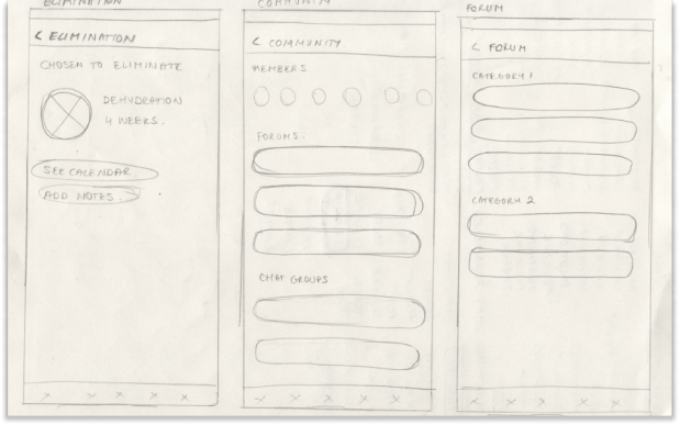
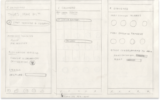
Wireframe Sketches
Wireframes in Figma

Branding
The visual component of this project was particularly important, as the user I’m dealing would most likely be in pain as they are interacting with the app. For this reason, and taking user stories into consideration, I knew I would need to design a darker interface. Perhaps it didn’t need to be full dark mode, but at least something that would be easy on the eyes.
From the user surveys, and just from talking to people that struggle with this pain, I learned that:
- I need to have as dark of an interface as possible, with a lower contrast (while still maintaining accessibility standards)
- Have as few words as possible, more shapes and images. People with headache pain do not want to read
- Use the color green, as this color is shown to reduce headache pain, while colors like red, blue and white seem to exacerbate it
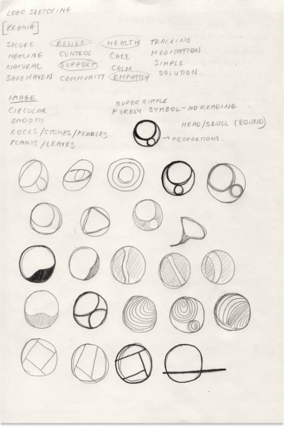
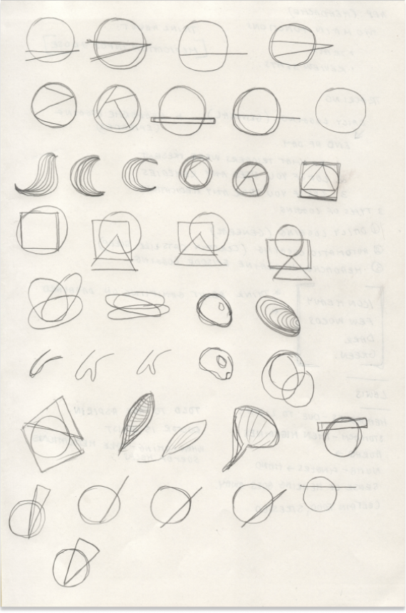
Logo Sketches
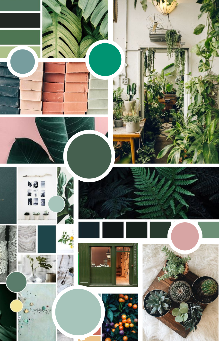
Moodboard and Logo Refinement
High Fidelity Mockups
Exploration
This was the tricky part for me. Many designers are thinking about how to make an interface as simple and easy to use as possible, but I felt like I had to take it to the next level.
However, I thought about my mantra with each component and system I was creating — this must be as pain-free to use and look at, as possible.
Is everything that I’m making the simplest form of itself?
Can it be easier to look at it? Can it be easier to use?
Revisions
I based my revisions on the following:
- 3 screen share usability tests with members of the design community that struggle with migraines, headaches, or both
- Preference tests released to the design and headache communities
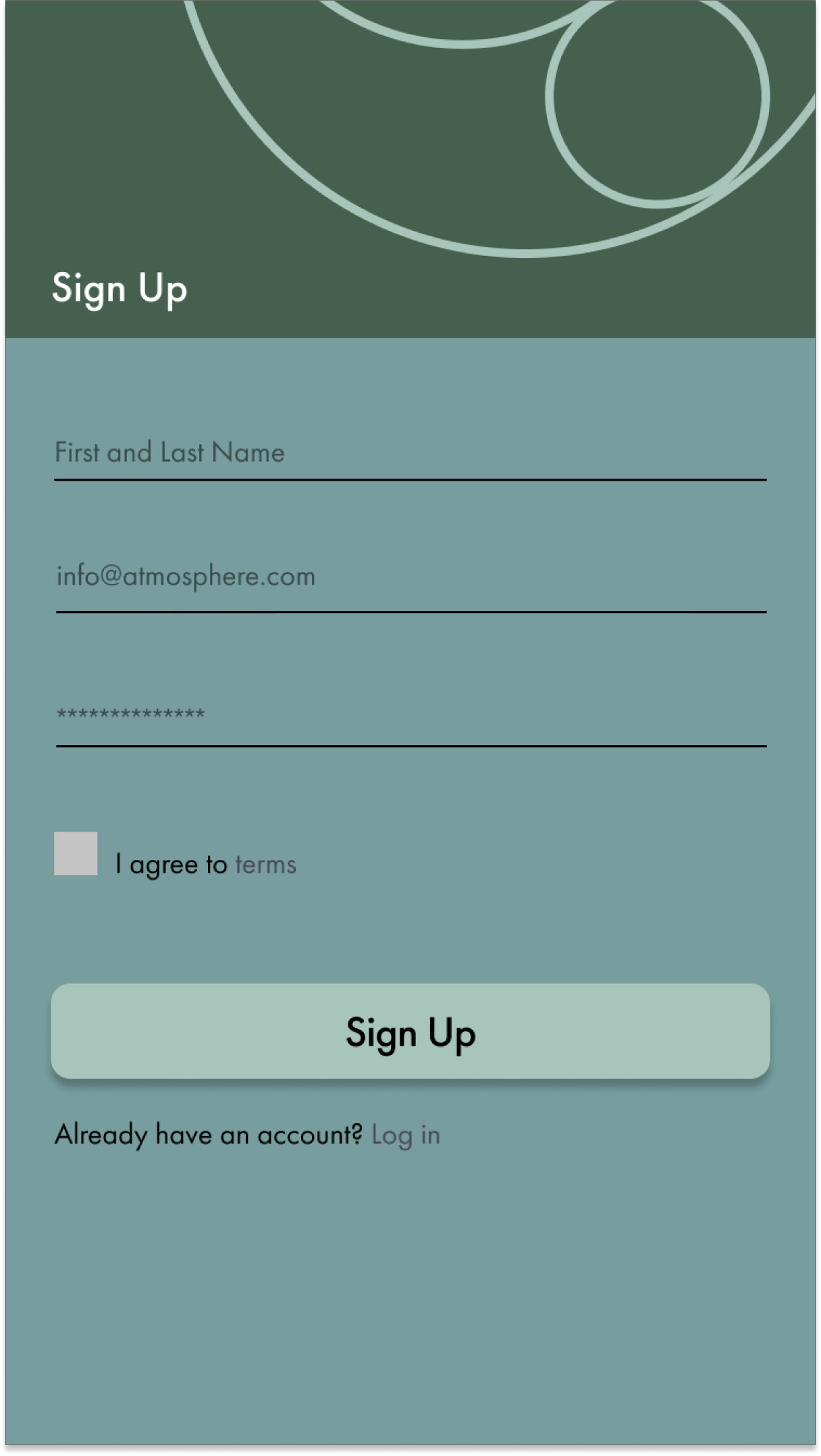
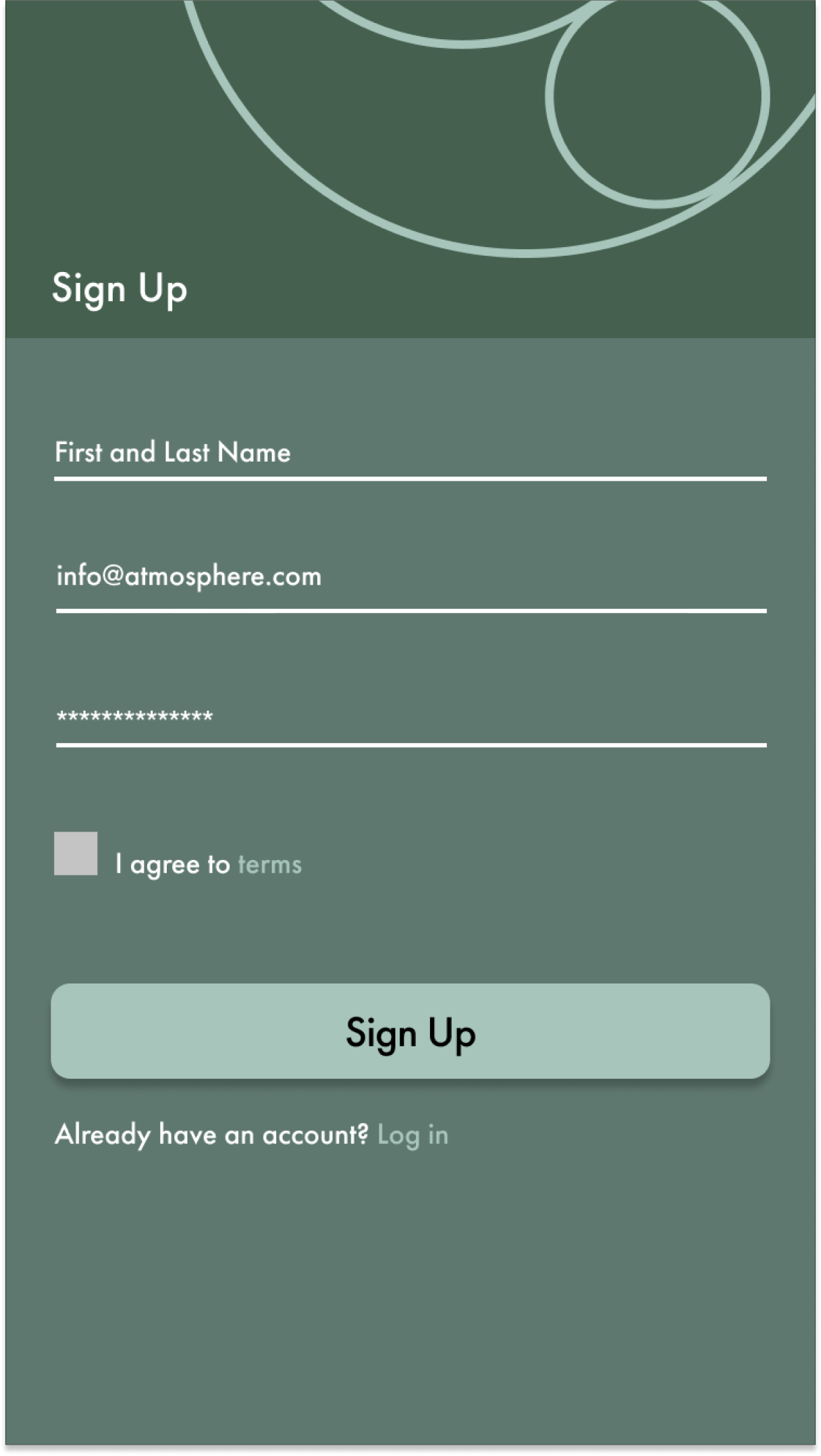
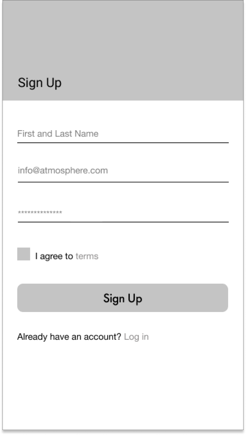
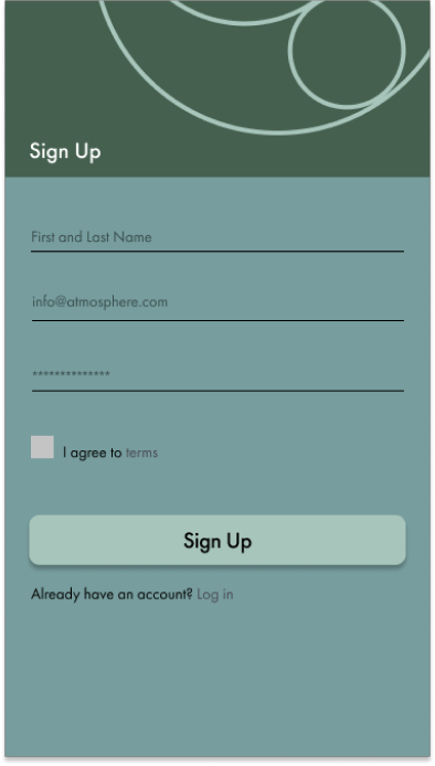
Version 1 "Sign Up" page versus Verion 2
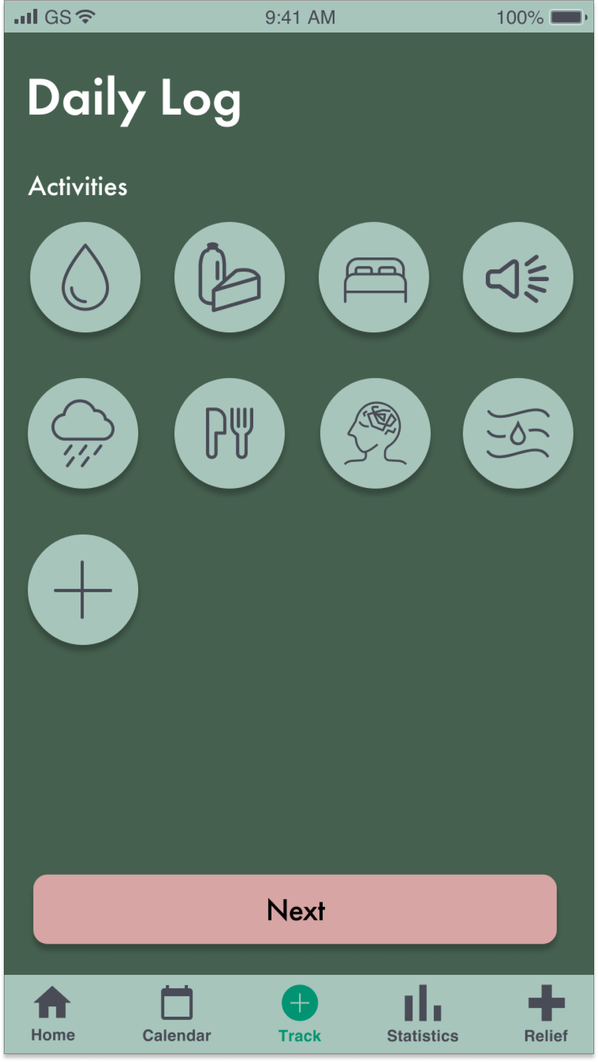
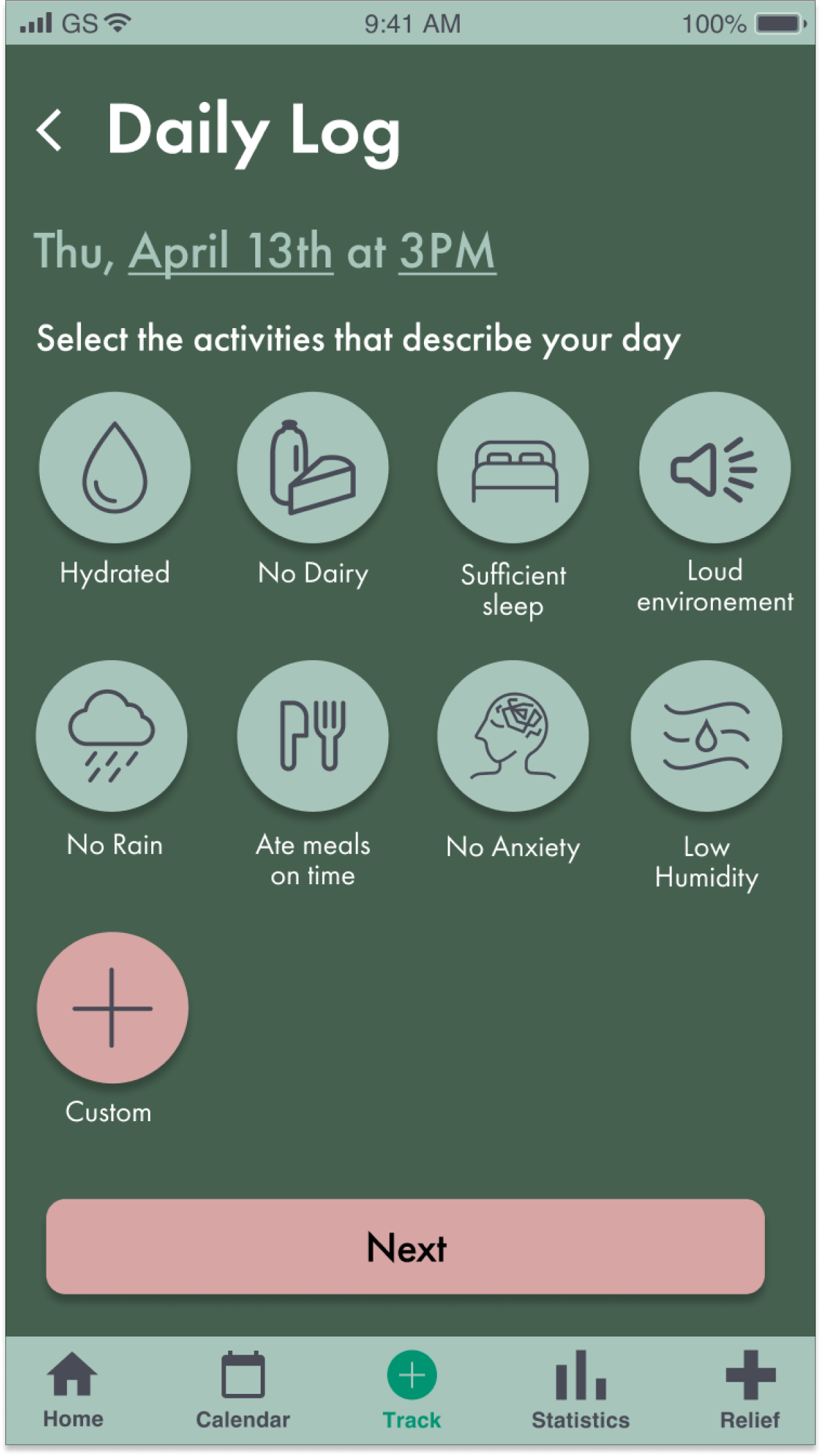
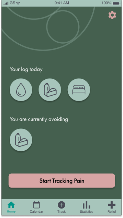
Version 1 "Daily Log" page versus Verion 2
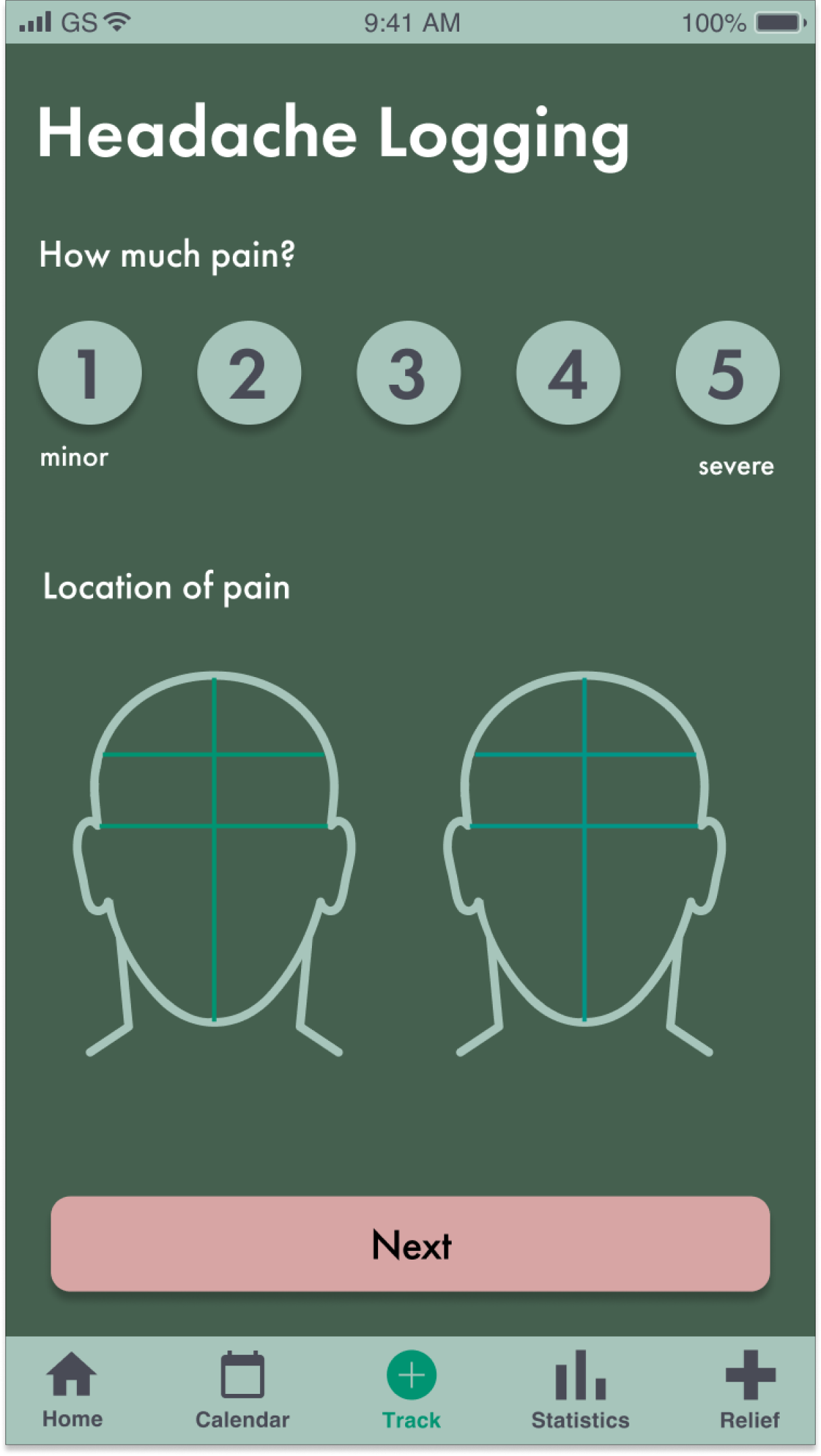
Version 1 "Headache Logging" page versus Verion 2
Usability Testing and Discoveries
The main tasks that I tested were those that we determined would be necessary for this product to serve its main purpose. This included:
1. Logging headache or migraine pain
2. Entering information in a daily log
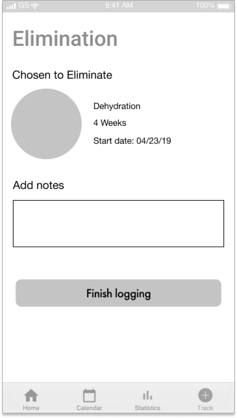
3. Determining a trigger to eliminate, and setting up a trigger elimination schedule
Here again, I had to check myself and go back to my main mantras for this product:
Is everything that I’m making the simplest form of itself?
Can it be easier to look at it? Can it be easier to use?
However, I wasn't striking a good balance between inluding the information necessary to have a clear interface, and trying to be as minimal as possible to reduce and experience friction and visual irritation.
Below I am showcasing some specific changes made based on 3 more usability testing sessions, while also considering my mantras.
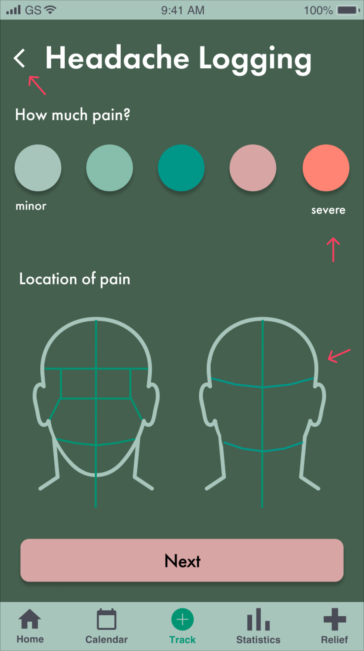
On clarifying hierarchy:
I found that people were consistently confused when they landed on this page. They weren't sure where to look, or what they were looking at.
I therefore tried to use color and size to increase the clarity and hierarchy of information. As headache and migraine logging would be the most common activity when one lands on this page, I tried to make that choice clearer.
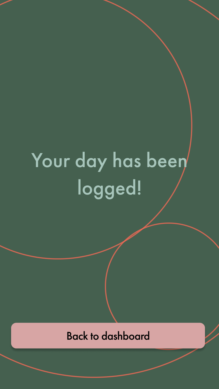
On better feeback:
It seemed like people were not sure when they finished logging, or if it was a bug that they were led back to the dashboard. They just weren't sure that they actually logged their information.
This was one of those instances where I tried to avoid making extra screens in order to decrease friction, but ended up sacrificing clarity. I created a success page to reinforce that a log was finished, but perhaps this could be a modal. Point is that feedback helps.
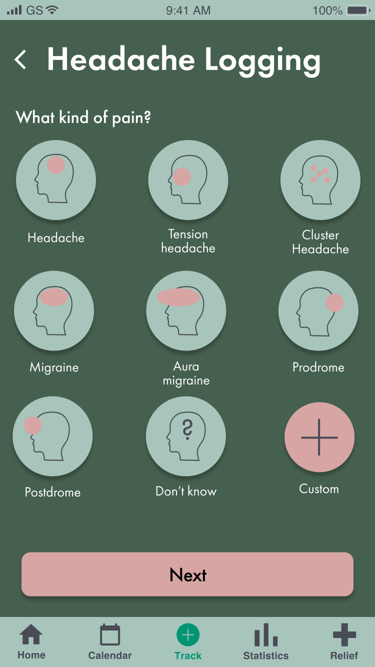
On increasing information input:
I realized that I was not being empathetic about the various types of headaches and migraines that people experience. I actullay didn't have this screen in my first high fidelity version.
As this is valuable information for the user to keep track of, I realized I needed to add this input section to the flow in order to more accurately track various sorts of pain.
Reflections
Below are some thoughts as I look back on the project. I wanted to make sure to I could quantify the exact takeaways, so I can have them readily available for future projects.
What Worked
Having design mantras.
The fact that I could go back to two mantras continuously throughout my designing phase was very helpful. When I got stuck in making a decision, I would just reference the mantras. Is this visual or work REALLY necessary? Is this experience as simple as it can possibly be? These north stars drove me to try to make the most valuable decision I could make at that moment.
What Didn't Work
Making assumptions about what people might find irritating in the experience.
I had decided for myself that the simpler this design was, the better. I was therefore very frugal with my copy, visuals, and feedback. I was so frugal that the experience suffered, and aspects of it were unclear since people just didn't have the feedback they're used to having.
If Given More Time
I would love to consult with medical professionals that either treat or study headache and migraines, so I could make more medically informed desing and experience decsions. I feel like that was a perspective I was certainly lacking in this experience.


